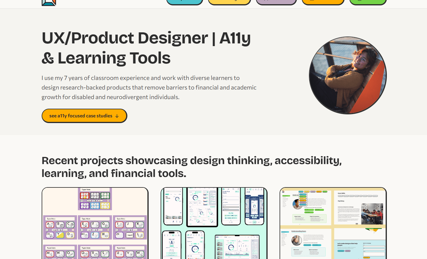
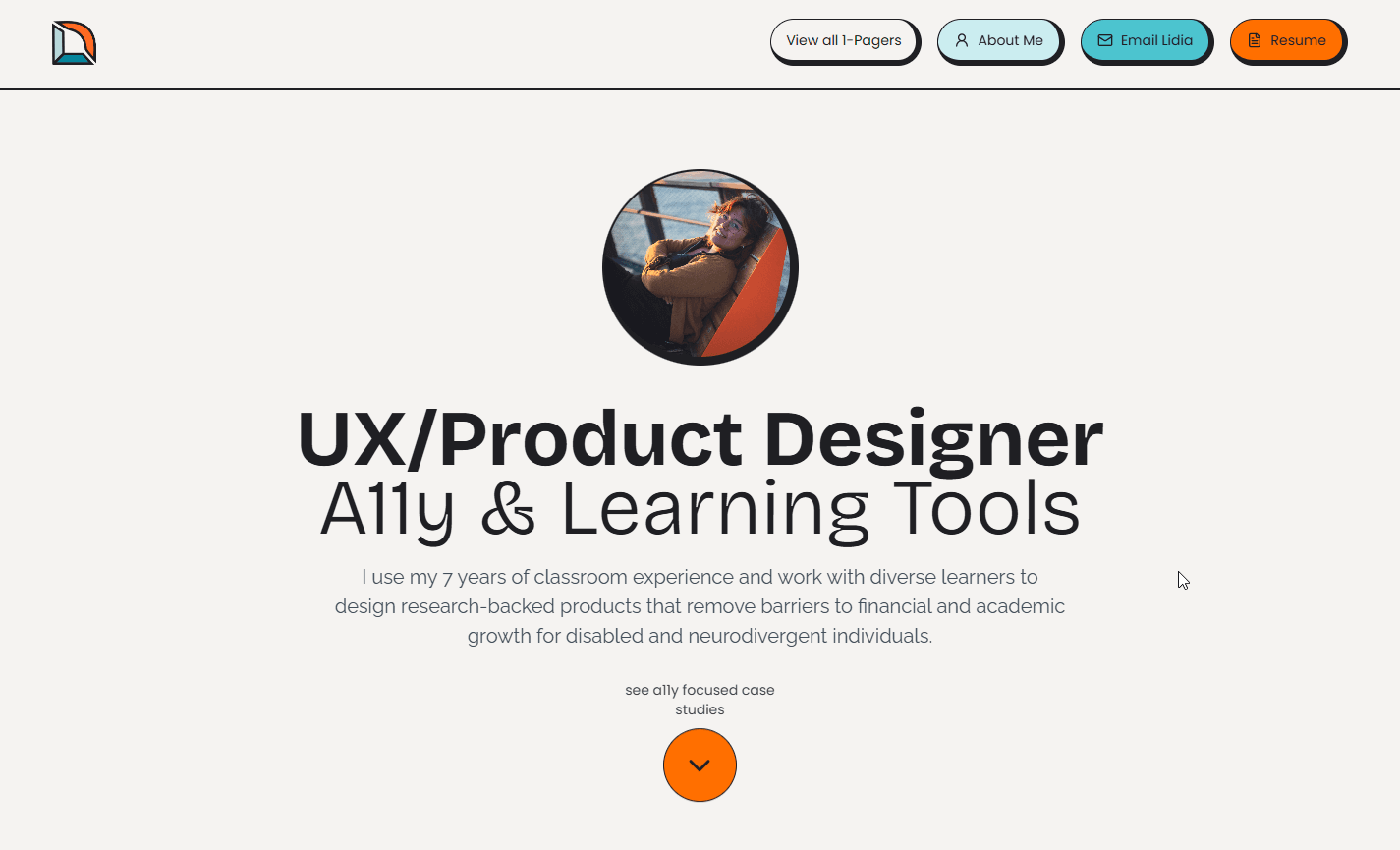
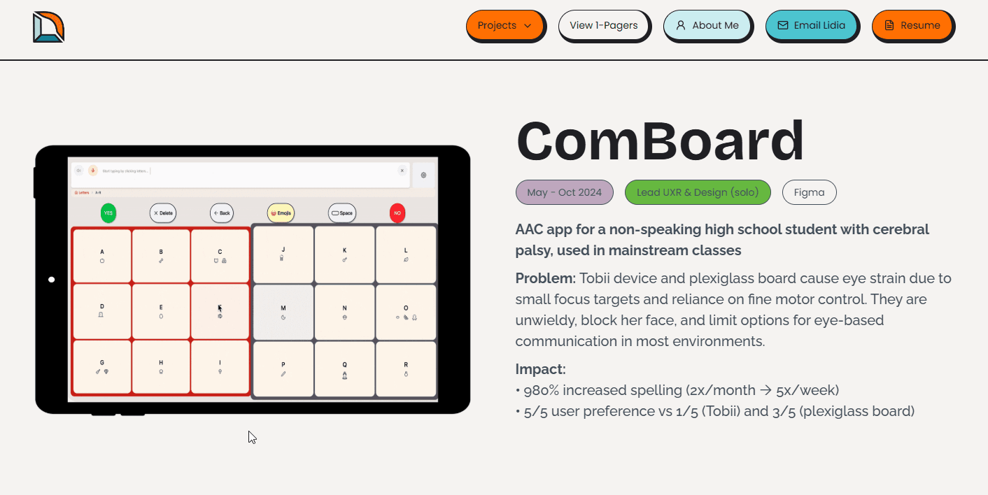
Portfolio Site
Rebuilding my portfolio from the ground up — replacing Webflow with hand-coded Astro to gain full control over accessibility, performance, and component architecture.
The Problem
My original portfolio was a Webflow site. It had case studies and presented my work, but the build itself had accumulated accessibility gaps: six font families, no dark mode, no skip links, underused semantic landmarks, and no reduced-motion handling. Webflow supports these features — I simply had not implemented them. For a designer whose core claim is accessibility expertise, the site was undermining the message. Rather than retrofit the existing build, I chose to start fresh in Astro so I could own every line of HTML and CSS and make the portfolio itself proof of the skills it describes.
Design Decisions
Every decision was guided by one question: does this make the recruiter's job easier while demonstrating the skills I claim to have?
Move from Webflow to Astro — a static site generator that gives me full control over markup, performance, and accessibility while producing zero-JS pages by default.
Embed full case studies on-site with side navigation, so recruiters never leave the page to evaluate my work.
Use CSS custom properties as design tokens so every color, spacing value, and radius is defined once and inherited everywhere — including per-project theme colors.
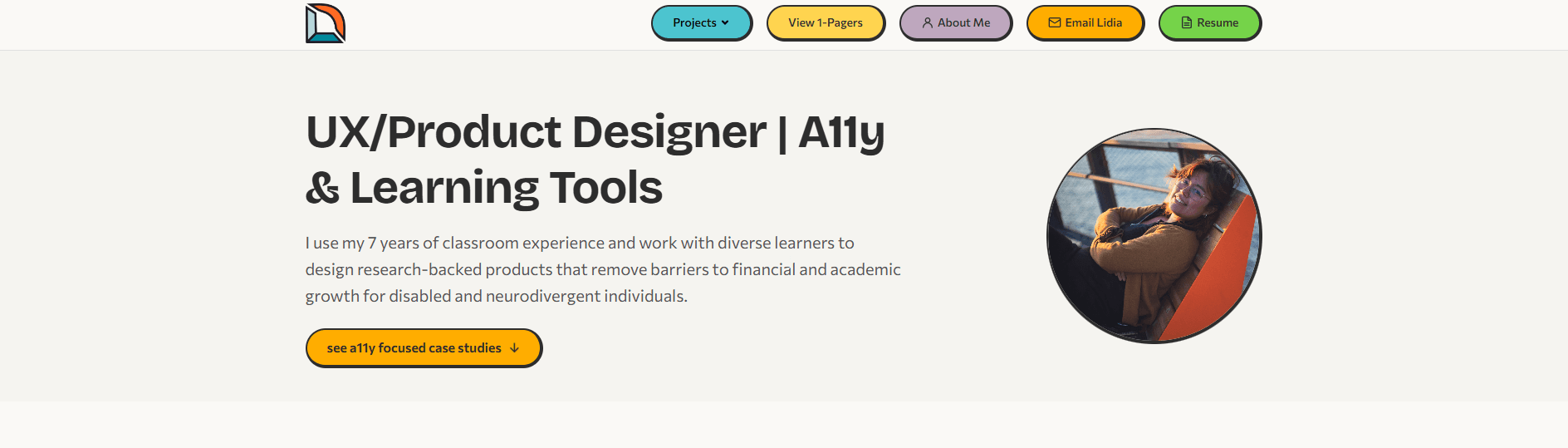
Neo-brutalist visual language with thick borders, pill buttons, and bold accent colors — playful enough to be memorable, structured enough to be scannable.
Reduce font families from six to two (Bricolage Grotesque for headings, Commissioner for body), cutting load time and visual noise.
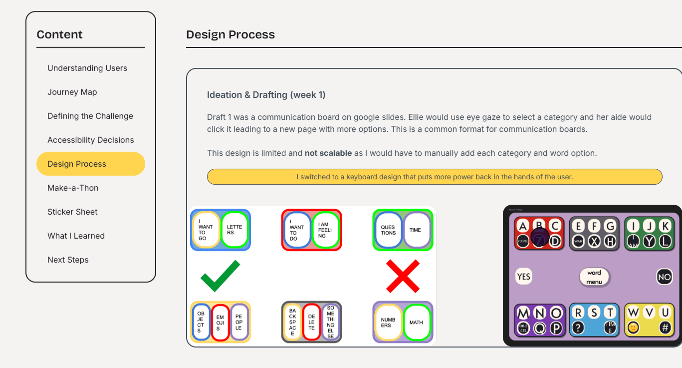
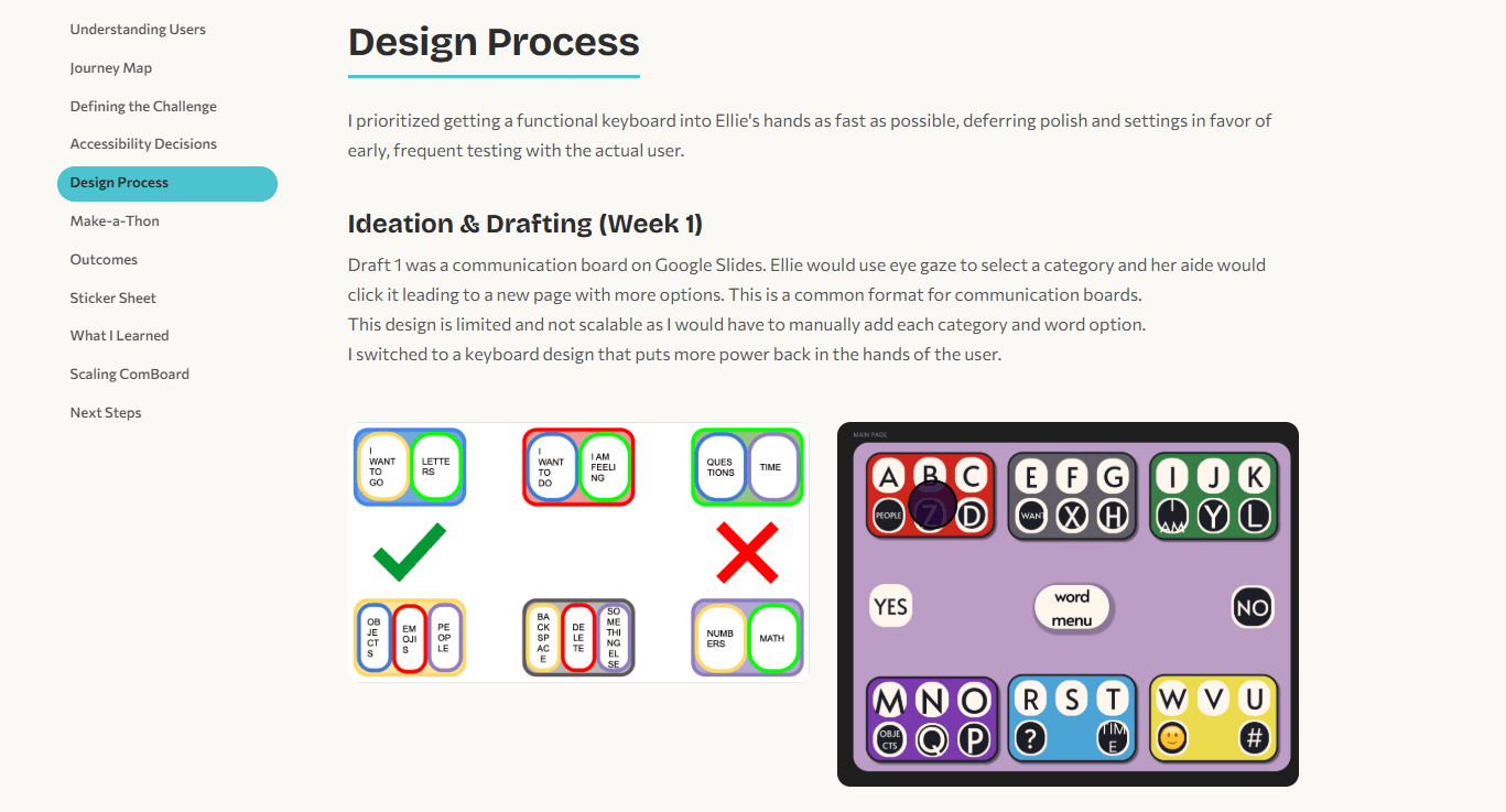
Design Process
I prioritized the case study reading experience first — that is where recruiters spend the most time — and worked outward to the homepage, navigation, and visual polish.
Architecture (Week 1)
My Webflow build had shared styles across pages, but they were difficult to manage — each page accumulated its own unique overrides and platform-generated class names, making it hard to enforce consistent accessibility patterns. Rather than retrofit, I restructured everything into a component-based Astro project: a shared BaseLayout, reusable components (Header, Footer, SideNav, ProjectCard, PrevNextNav), and dedicated pages for each case study. This gave me full control over semantic markup, ARIA attributes, and a CSS custom property system.

Visual Design (Week 2–3)
I chose a neo-brutalist style to stand out in a sea of minimal portfolios. Thick offset borders, pill-shaped buttons, and bold project accent colors give each case study its own identity while a shared design token system keeps everything consistent. The color palette assigns each project a theme color — teal for ComBoard, green for Budget App, yellow for this portfolio — that cascades through headings, badges, card backgrounds, and interactive elements via a single CSS custom property.
 Pill-shaped buttons Pill CTA with accent color
 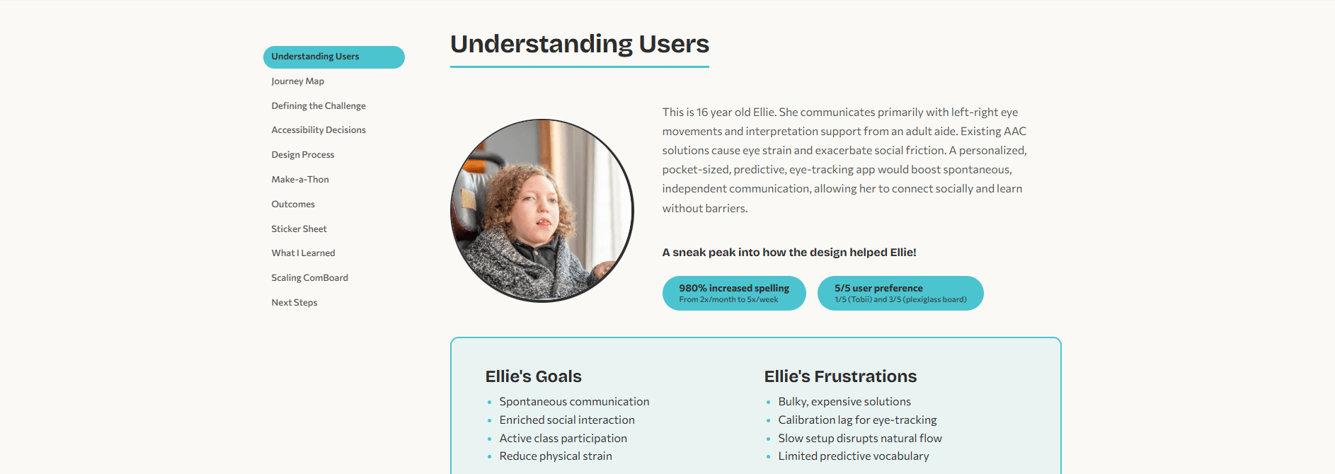 Thick offset border Pill-shaped outcome badges Project accent color (teal) Sticky side navigation
  Pill-shaped skill tags with offset borders
 Before & After
Side-by-side comparisons showing how the same content was restructured from the original Webflow build to the Astro rebuild.
The original hero used a centered layout with an orange CTA button that failed WCAG contrast requirements with the dark text. The rebuild shifts to a left-aligned layout for faster scanning, replaces the low-contrast orange (#FF6F00) with a higher-contrast shade (#ffd44f), and adds a Projects dropdown in the nav so recruiters can jump directly to any case study.
The original project cards used a single teal background for every card, making it hard to distinguish projects at a glance. The rebuild gives each project its own accent color, adds clear visual hierarchy with date and role metadata above the title, and replaces the plain text link with a full-width pill CTA.
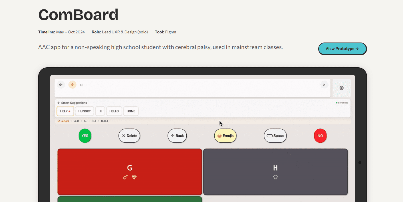
The original case study hero crammed the iPad mockup and text description side-by-side, competing for attention. The rebuild separates concerns: a clean metadata row (timeline, role, tool) sits above the title, and the prototype gets its own full-width space below. The nav now applies a unique color to every pill button for clearer visual distinction.
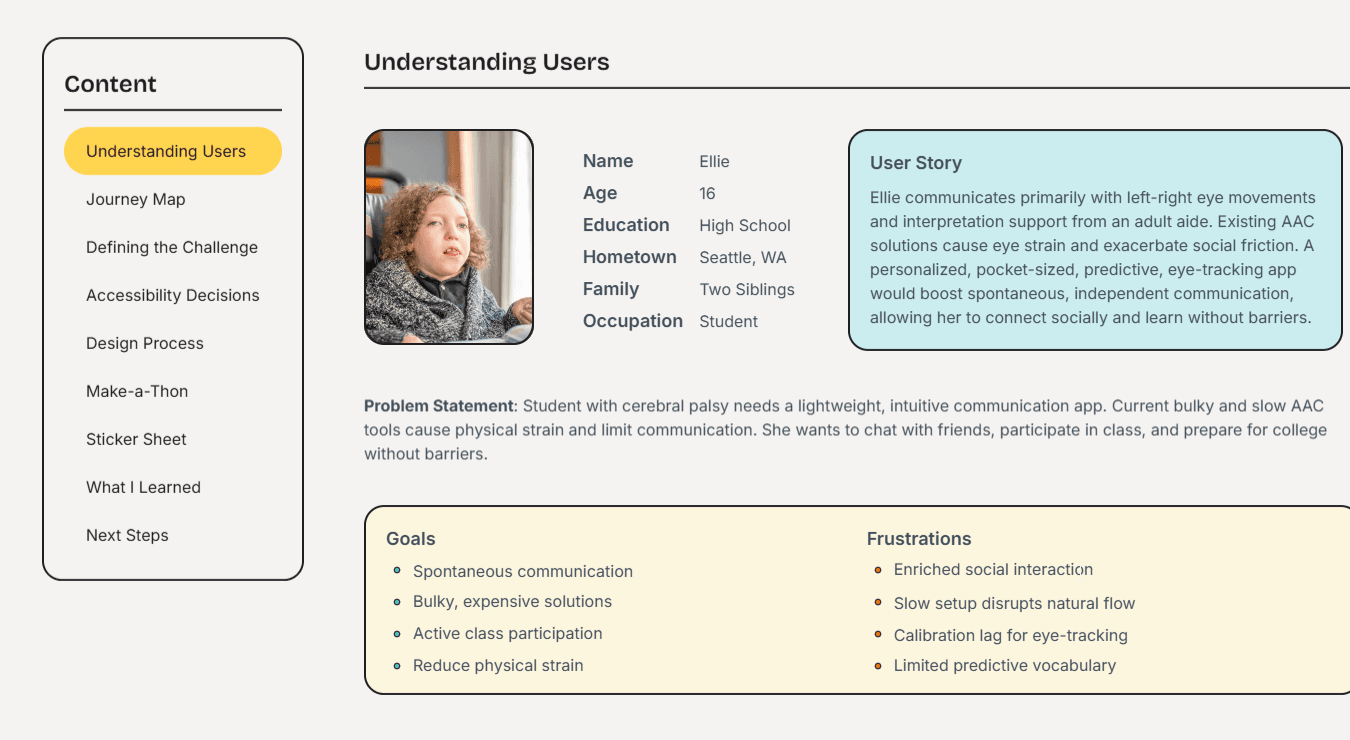
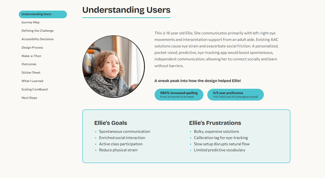
The original persona used a flat table layout that treated the user story as a sidebar. The rebuild centers the persona around a circular photo — consistent with photo styling throughout the site — with the user story as flowing body text, and adds project-colored outcome badges for immediate impact visibility. Goals and Frustrations are wrapped in a clearly bordered card with consistent spacing. The side navigation switches from a boxed "Content" label with a yellow highlight to a cleaner project-colored active-state indicator. All color choices are consistent and harmonious.
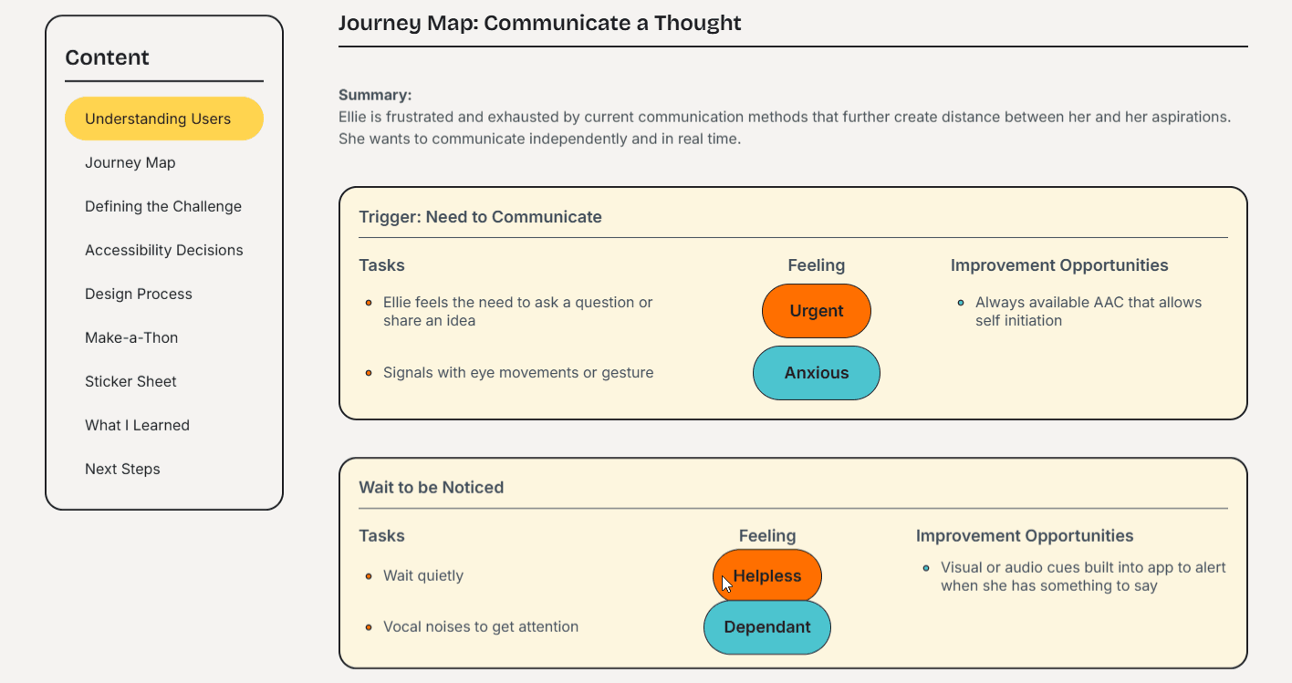
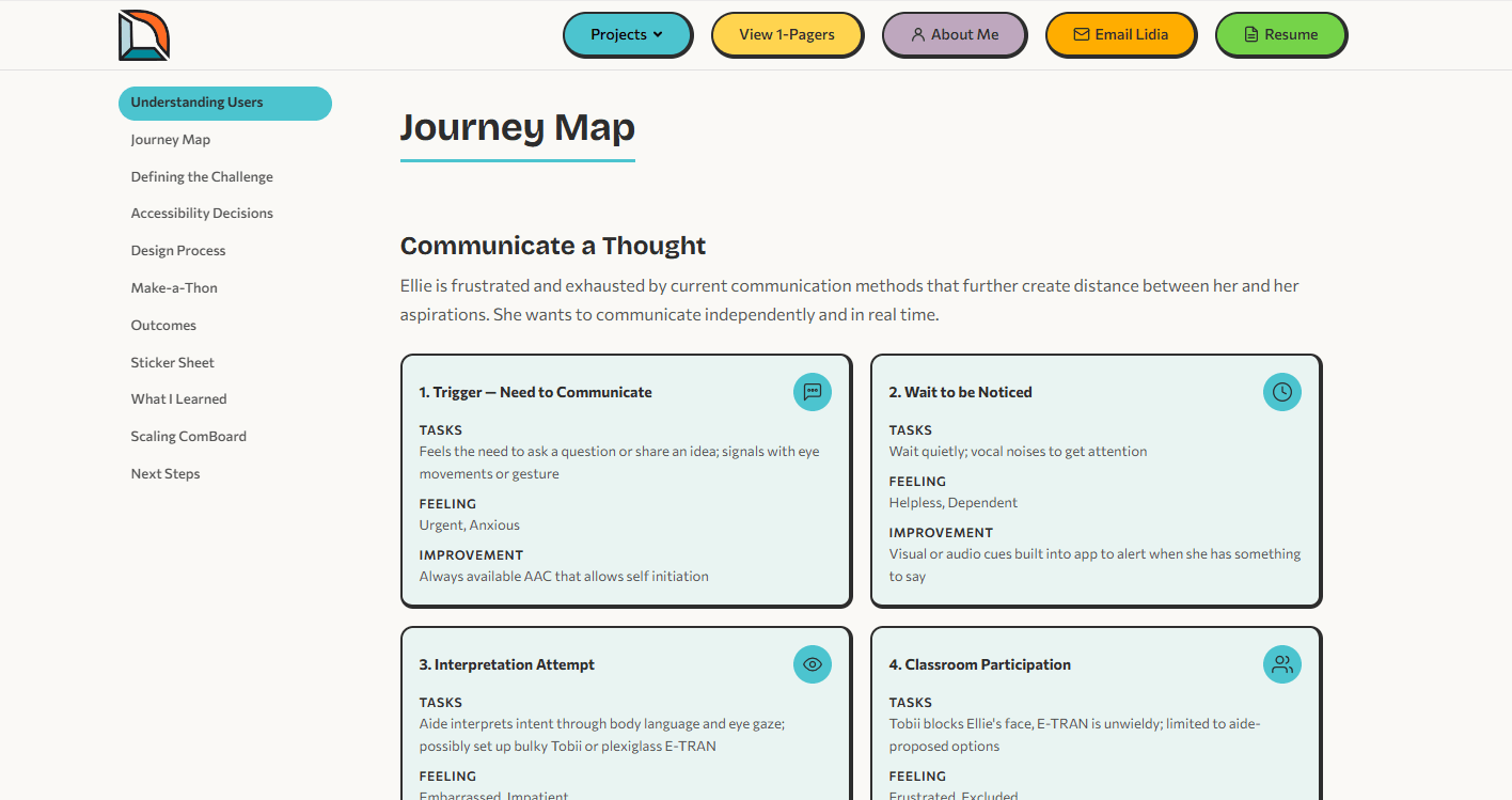
The original journey map relied on colored emotion pills (orange, teal) that were difficult to distinguish and lacked structure beyond a simple table. The rebuild organizes each journey step into its own bordered card with a clear heading, icon, and structured Tasks, Feeling, and Improvement sections. The four-step grid makes it easy to scan the full journey at a glance.
The original design process section used a pill-shaped call-out in the same yellow as the highlighted active state in the navigation, causing visual confusion, and placed the communication board drafts inside a box. The rebuild avoids unnecessary noise, removes the container so the drafts breathe, and uses clear heading hierarchy (h2 section title, h3 week label) to separate narrative from visuals.
Accessibility
Accessibility is the core claim of my portfolio, so the site itself must be the proof. Every decision was tested against WCAG 2.2 AA, with several elements reaching AAA.
Color contrast: All text meets AAA requirements (7:1+). Project accent colors were tested against both light and dark backgrounds to ensure readability in both themes.
Semantic structure: Every page uses proper heading hierarchy, landmark regions, and ARIA labels. Screen readers can navigate the full site without confusion.
Keyboard navigation: Skip links on every page. Focus-visible outlines on all interactive elements. Dropdown menus respond to Escape and arrow keys.
Motion & theming: Scroll-triggered animations are suppressed when the user has prefers-reduced-motion enabled. Dark mode respects the OS setting and persists across sessions.
Dev Handoff
Because I both designed and built this site, I had the opportunity to practice what dev handoff looks like from both sides. The component spec below documents the ProjectCard component — its props, design tokens, spacing, and interaction states — in the format a developer would need to implement it from a design file.

Every reusable element on this site — ProjectCard, SideNav, PrevNextNav, Header, Footer — follows this same pattern: clearly typed props, consistent use of design tokens, and predictable interaction states. This structure means a new case study page can be added by writing content and passing props to existing components, with no new CSS required.
View Full Component Reference →Outcomes
The rebuild transformed the original portfolio into a fully accessible, component-driven site that puts the work front and center.
What I Learned
Building my own portfolio from design to deployment taught me what it actually feels like to be on both sides of a handoff. Naming a Figma component is one thing; writing the CSS that implements it and realizing your naming was ambiguous is another. I now approach design system work with a much sharper eye for what a developer will need versus what looks organized in a design file. I also learned that accessibility is not a checklist you run at the end — it is an architectural decision you make at the beginning. Retrofitting skip links and ARIA onto a finished page is painful; building with semantic HTML from the start makes it effortless. Finally, using Claude Code as a development partner taught me how to communicate design intent precisely enough for an AI to implement it, which turns out to be the same skill needed to write a good design spec for a human engineer.