← Back to case study
Component Reference
Portfolio Design System — Dev Handoff Documentation
Every reusable element on this site follows the same pattern: clearly typed props, consistent use of design tokens, and predictable interaction states. A new case study page can be added by writing content and passing props to existing components, with no new CSS required.
ProjectCard
ProjectCard Reusable
Displays a project with thumbnail, metadata, description, and CTA. Renders as a list item within the projects grid.
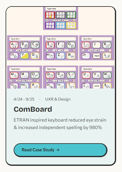
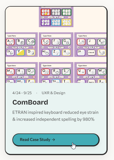
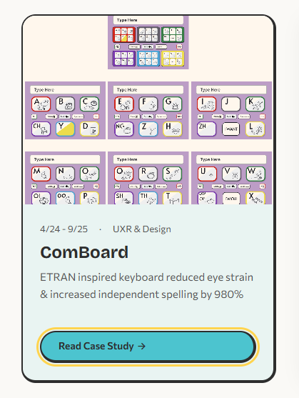
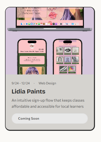
Visual Preview
Default
Hover
Focus-visible
Disabled
Props
| Prop | Type | Required | Description |
|---|
image | string | Yes | Thumbnail image path |
alt | string | Yes | Image alt text |
date | string | Yes | Timeline range (e.g. "4/24 – 9/25") |
role | string | Yes | Designer role on project |
title | string | Yes | Project name (rendered as h3) |
description | string | Yes | One-line project summary |
href | string | No | Link to case study page |
disabled | boolean | No | Shows "Coming Soon" badge instead of CTA |
accentColor | string | No | Sets --card-accent for theme color |
Usage
<ProjectCard
image="/images/comboard/thumbnail.png"
alt="ComBoard app showing ETRAN keyboard"
date="4/24 – 9/25"
role="UXR & Design"
title="ComBoard"
description="ETRAN keyboard reduced eye strain"
href="/comboard"
accentColor="#4cc4cf"
/>
<ProjectCard
image="/images/placeholder.png"
alt="Lidia Paints preview"
date="Coming 2026"
role="Art"
title="Lidia Paints"
description="Personal art portfolio"
disabled
/>
Tokens Used
| Property | Token | Value |
|---|
| Card radius | --radius-lg | 20px |
| Body padding | --space-md | 24px |
| Image aspect ratio | — | 4 / 3 |
| Border | --border-neo-thick | 2px sides, 4px right + bottom |
| Meta font | — | 0.8125rem / 600 |
| Title font | --font-heading | Bricolage Grotesque 700 |
| Body font | --font-body | 0.9375rem / 500 |
| CTA radius | --radius-full | pill (9999px) |
States
- Default Static card with accent bar and CTA
- Hover
translateY(-4px), box-shadow grows, image zooms to scale(1.06)
- Focus-visible
3px solid var(--color-accent) outline with 2px offset
- Disabled
pointer-events: none, muted background, "Coming Soon" badge replaces CTA
Guidelines
Do
- Use inside a
<ul> grid for proper list semantics
- Provide a unique
accentColor per project for visual distinction
- Write concise descriptions under two lines
- Always include meaningful
alt text for the thumbnail
Don't
- Use for non-project content (blog posts, team bios, etc.)
- Omit
href on active projects — every shipped project needs a link
- Set
disabled and href together — pick one
- Reuse the same
accentColor for adjacent cards
Responsive Behavior
| Breakpoint | Layout | Notes |
|---|
| ≥ 768px | 3-column grid | Cards share equal width, images maintain 4:3 |
| < 768px | Single column | Cards stack full-width, same internal spacing |
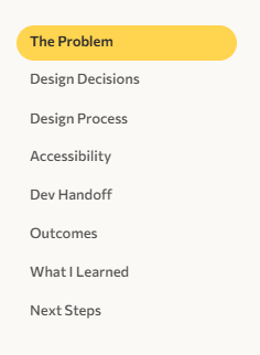
SideNav
SideNav Reusable
Sticky sidebar navigation with scroll-spy highlighting. Displays section links with an animated highlight pill that follows the active section.
Visual Preview
Default (active on first section)
Props
| Prop | Type | Required | Description |
|---|
sections | { id: string; label: string }[] | Yes | Array of section IDs and display labels |
Usage
<SideNav sections={[
{ id: "understanding-users", label: "Understanding Users" },
{ id: "journey-map", label: "Journey Map" },
{ id: "defining-challenge", label: "Defining the Challenge" },
{ id: "design-process", label: "Design Process" },
{ id: "outcomes", label: "Outcomes" },
]} />
Tokens Used
| Property | Token | Value |
|---|
| Sticky offset | — | top: 80px |
| Link padding | — | 4px 12px |
| Link font | — | 0.8125rem / 500 |
| Highlight radius | --radius-full | pill (9999px) |
| Highlight color | --color-project | Per-project theme color |
| Animation | --transition-base | 300ms ease |
| Gap | — | 6px |
States
- Default Muted text, no background
- Active
aria-current="true", bold text, colored highlight pill behind link
Guidelines
Do
- Match
id values to actual section IDs on the page
- Keep labels short (2–3 words) so they fit without wrapping
- Set
--color-project on the page to match the project theme
Don't
- Use on pages with fewer than 3 sections — not worth the chrome
- Duplicate the SideNav — only one per page for scroll-spy to work
- Add external links — this is for in-page navigation only
Responsive Behavior
| Breakpoint | Behavior |
|---|
| ≥ 992px | Visible as sticky sidebar, scroll-spy active |
| < 992px | Hidden entirely (display: none). Users scroll freely or use the header nav. |
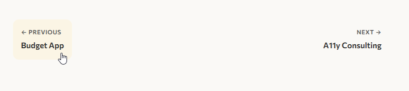
PrevNextNav
PrevNextNav Reusable
Project pagination bar shown at the bottom of case study pages. Displays previous and next project links.
Visual Preview
Hover (previous link)
Props
| Prop | Type | Required | Description |
|---|
prev | { title: string; href: string } | No | Previous project link and title |
next | { title: string; href: string } | No | Next project link and title |
Usage
<PrevNextNav
prev={{ title: "ComBoard", href: "/comboard" }}
next={{ title: "Portfolio Site", href: "/portfolio-site" }}
/>
<PrevNextNav
next={{ title: "Portfolio Site", href: "/portfolio-site" }}
/>
Tokens Used
| Property | Token | Value |
|---|
| Container gap | --space-md | 24px |
| Padding | --space-sm | 16px |
| Border radius | --radius-md | 12px |
| Label font | — | 0.75rem / 600, uppercase |
| Title font | — | 1rem / 600 |
| Top border | --color-border | 1px solid |
States
- Default Label + title stacked vertically, no background
- Hover
background: var(--color-card-bg) fills the link area
Guidelines
Do
- Place at the very bottom of each case study, after all content
- Omit
prev on the first project and next on the last
- Use the exact project title as it appears in the card
Don't
- Link to external pages — this is for internal project navigation only
- Use on the homepage or non-case-study pages
- Pass both props as empty — if there is no navigation, omit the component
Responsive Behavior
| Breakpoint | Behavior |
|---|
| ≥ 0px | Always visible. Flexbox layout with space-between. Both links remain side-by-side at all widths. Text truncates naturally if the viewport is very narrow. |
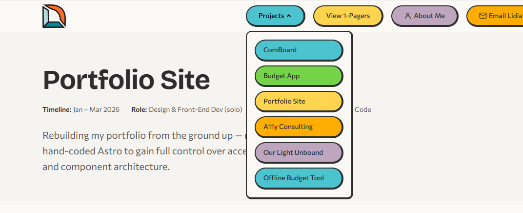
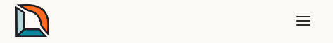
Header Layout
Sticky site header with logo, desktop pill navigation, projects dropdown, and mobile hamburger menu. No props — navigation items are hard-coded.
Visual Preview
Desktop

Projects dropdown open
Mobile (closed)
Mobile (open)
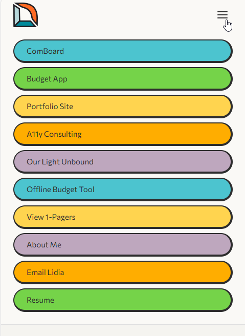
Structure
| Element | Description |
|---|
| Logo | Links to home, 48px height |
| Nav pills | Color-coded pill buttons with individual inline accent colors |
| Projects dropdown | Click-triggered, closes on outside click or Escape |
| Mobile menu | Hamburger toggle, full nav list, visible below 960px |
Usage
<Header />
<body>
<SkipLink />
<Header />
<main id="main-content"> ... </main>
<Footer />
</body>
Tokens Used
| Property | Token | Value |
|---|
| Background | --color-nav-bg | #faf9f6 / #222 |
| Position | — | sticky, top: 0, z-index: 1000 |
| Inner max-width | --max-width | 1200px |
| Pill padding | --space-xs / --space-md | 8px 24px |
| Pill radius | --radius-full | pill (9999px) |
| Pill font | — | 0.875rem / 500 |
| Border | --border-neo-thick | 2px + 4px offset |
States
- Default Colored pill with neo-brutalist border
- Hover
brightness(0.88), translateY(-2px), subtle shadow
- Focus-visible
3px solid var(--color-accent) outline
- Disabled
opacity: 0.5, pointer-events: none
- Dropdown open
aria-expanded="true", panel visible
- Mobile open Menu slides in, toggle becomes close icon
Guidelines
Do
- Include exactly once per page, at the top of the layout
- Pair with
<SkipLink /> for keyboard accessibility
- Update the dropdown project list when new case studies are added
Don't
- Override pill colors via external CSS — edit the inline styles in the component
- Remove the mobile menu — it is the primary nav under 960px
- Nest inside a container with
overflow: hidden — the sticky position and dropdown will break
Responsive Behavior
| Breakpoint | Behavior |
|---|
| ≥ 960px | Full desktop nav with pill buttons and Projects dropdown. Mobile toggle hidden. |
| < 960px | Desktop pills hidden. Hamburger toggle appears. Tapping it reveals a full-screen mobile nav with all links stacked vertically. |
Footer Layout
Site-wide footer with CTA heading, social links, and contact form. No props — content is hard-coded.
Visual Preview
Desktop (2-column)
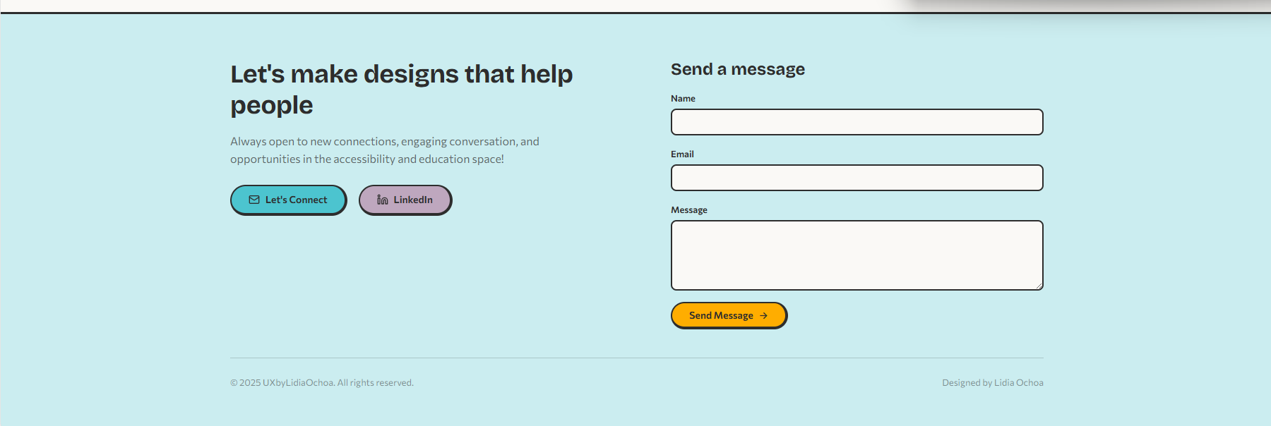
Mobile (single-column)
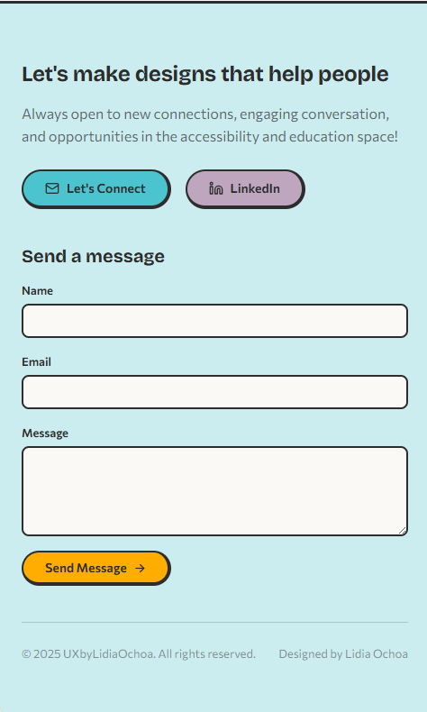
Structure
| Element | Description |
|---|
| CTA section | Heading, body text, Email + LinkedIn pill buttons |
| Contact form | Name, Email, Message fields via Web3Forms API |
| Footer bottom | Copyright + attribution |
Usage
<Footer />
Tokens Used
| Property | Token | Value |
|---|
| Background | --color-footer-bg | #cbedf0 / #1e3a4a |
| Text | --color-footer-text | #2d2d2d / #e8e8e8 |
| Grid layout | — | 1col → 2col at 768px |
| Padding | --space-xl / --space-lg | 64px top, 40px bottom |
| Top border | --color-shadow | 3px solid |
| Link pills | --radius-full | Same neo-brutalist style as header |
States
- Link hover
brightness(0.88), translateY(-2px), shadow
- Form submit Button disabled during send, success message with
aria-live="polite"
Guidelines
Do
- Include once per page, always as the last element before
</body>
- Test the contact form after deploying — Web3Forms needs a valid API key
- Keep the CTA heading action-oriented and personal
Don't
- Add navigation links here — that's the header's job
- Remove the
aria-live region — it announces form success to screen readers
- Expose the Web3Forms API key in client-side logs
Responsive Behavior
| Breakpoint | Behavior |
|---|
| ≥ 768px | Two-column grid: CTA + links on left, contact form on right |
| < 768px | Single column: CTA section stacks above the contact form |
Design Tokens
All components draw from a shared set of CSS custom properties defined on :root. Dark mode overrides are handled via prefers-color-scheme: dark.
Spacing
--space-xs | 0.5rem (8px) |
--space-sm | 1rem (16px) |
--space-md | 1.5rem (24px) |
--space-lg | 2.5rem (40px) |
--space-xl | 4rem (64px) |
--space-2xl | 6rem (96px) |
Radii
--radius-sm | 8px |
--radius-md | 12px |
--radius-lg | 20px |
--radius-full | 9999px (pill) |
Colors
--color-accent | #ffd44f |
--color-orange | #ffad00 |
--color-teal | #4cc4cf |
--color-green | #75d349 |
--color-mauve | #bea7be |
--color-pink | #f13989 |
Typography
--font-heading | Bricolage Grotesque |
--font-body | Commissioner |
| Base size | 1rem (16px) |
| Line height | 1.6 |
Borders
--border-neo | 2px solid |
--border-neo-thick | 4px (right + bottom) |
--color-shadow | #2d2d2d / #555 |
Transitions
--transition-fast | 150ms ease |
--transition-base | 300ms ease |