Bb Budget
A budgeting tool I designed, built, and use daily — from solo offline prototype to multi-user cloud platform with bank integration and end-to-end encryption.
Overview
Bb Budget started as a personal fix — I was budgeting with a spreadsheet, downloading CSVs from multiple banks, categorizing transactions by hand, and putting it off for weeks at a time. I needed a tool that automated the tedious parts while keeping me in control of every number. Unlike the Budget App case study — which focuses on research and prototyping — this project is about designing, building, and shipping a real product I use to manage my own finances.
Design Decisions
Visual Design
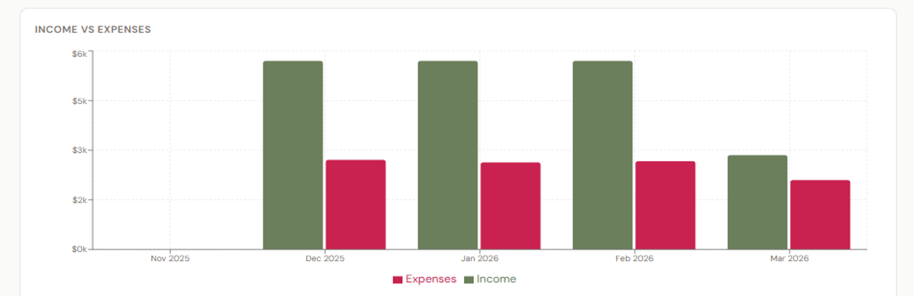
A warm, muted palette — olive green for income, muted rose for expenses — reduces the anxiety that comes with financial dashboards. Softer tones convey information without judgment, and generous whitespace keeps the interface calm rather than clinical.
Information Architecture
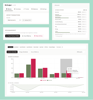
Five tabs — Review, Summary, Trends, Balances, Settings — each with a single purpose. Flat navigation, no nested menus, most important actions first.

One Task Per Screen
Each tab answers one question: Review → "what did I spend?" Summary → "am I on budget?" Trends → "what are the patterns?" Balances → "are the numbers right?" Settings → "how do I want this to work?"
The Work
Phase 1: Offline Tool
All screenshots use generated demo data — no real financial information is shown.
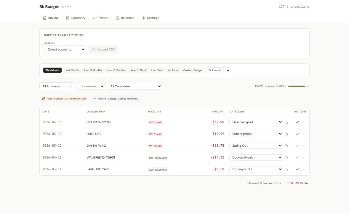
Transaction Review
Import bank CSVs and categorize transactions individually or in bulk. Auto-categorize handles repeat merchants, and a progress bar turns a tedious task into a completable one.

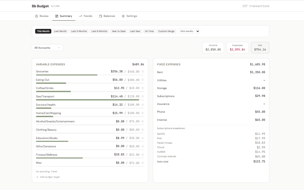
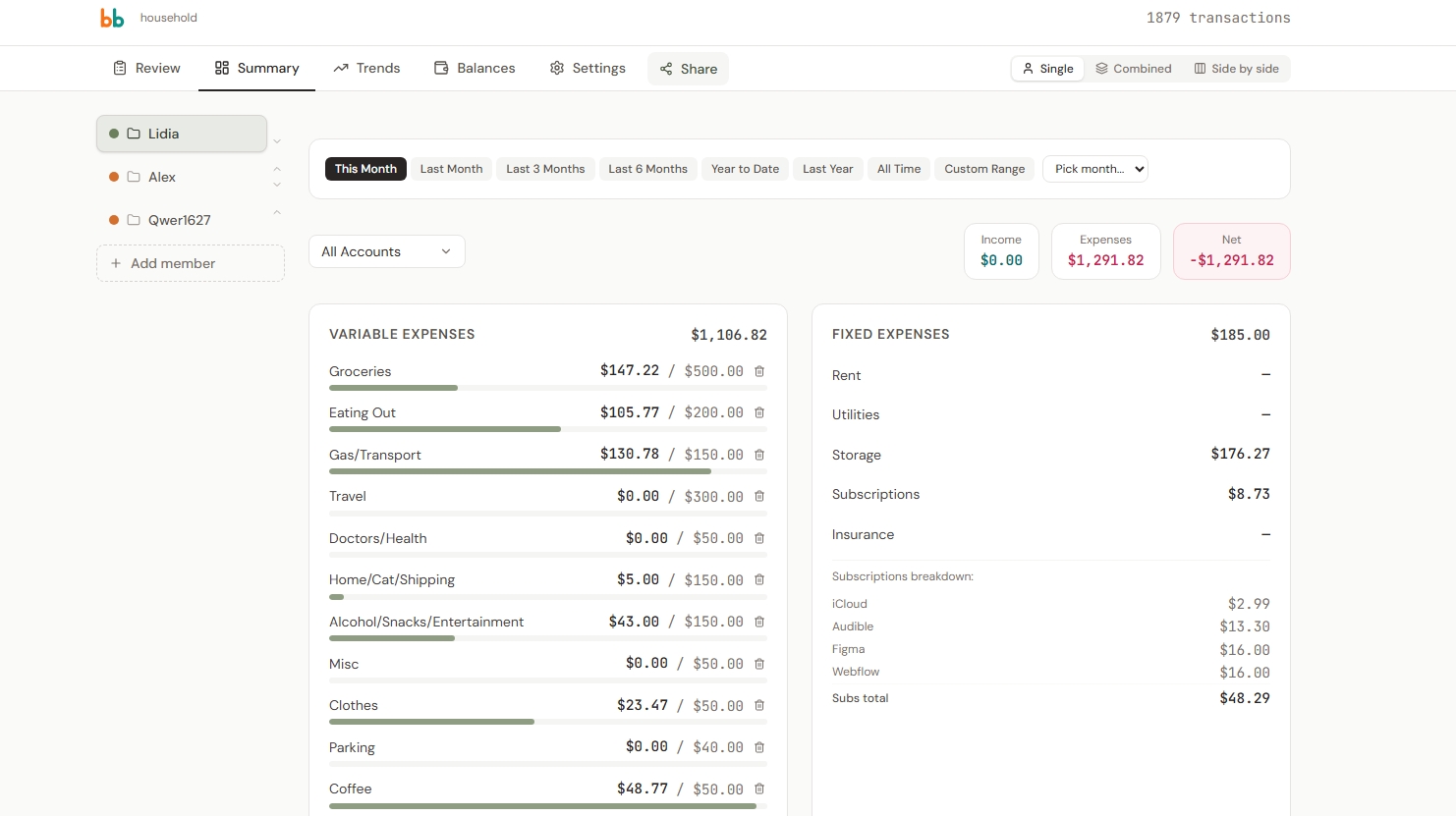
Monthly Summary
Variable and fixed expenses with budget targets. Progress bars show spending against each category's limit. Subscriptions itemized so nothing hides in a lump sum.
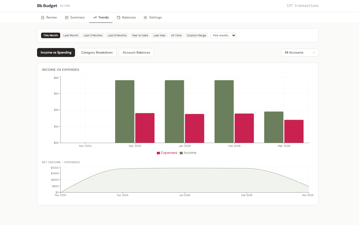
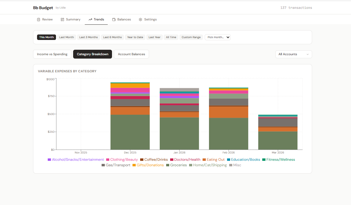
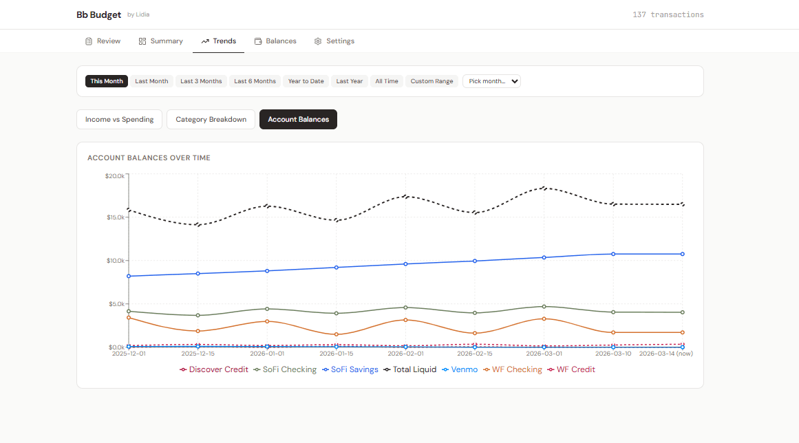
Trends
Three visualizations — Income vs Spending, Category Breakdown, and Account Balances over time — with adjustable time range filters. Patterns invisible in transaction lists become clear in visual form.
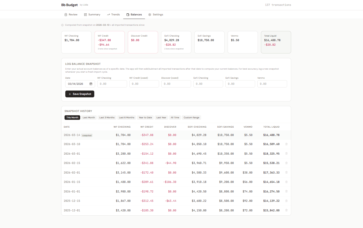
Balances
Users log balance snapshots — actual account totals on a given date — and the app computes current balances from imported transactions. This is where trust in the tool gets built.
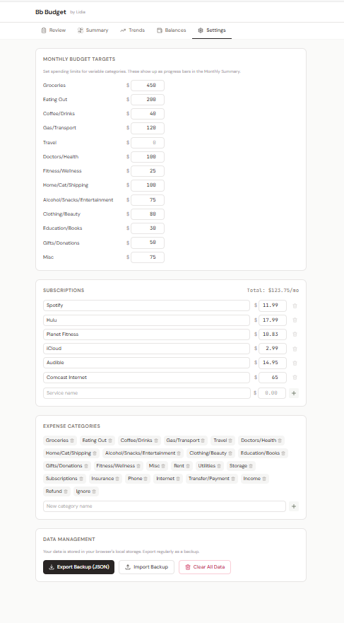
Settings & Data Management
Custom categories, subscription tracking, budget targets, and full JSON backup/restore. Data never leaves the browser unless explicitly exported.
Accessibility
An honest audit revealed six concrete gaps. Rather than claim compliance I hadn't earned, I treated each one as a design task and fixed it.
What the Audit Found — and What I Fixed
Text contrast: Secondary text (helper text, inactive tabs, chart labels) was upgraded from stone-400 to stone-500/600 across all components. All text now meets WCAG AA. Primary body text (#292524 on #fafaf9) achieves ~16.5:1.
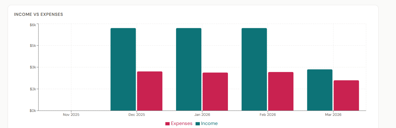
Colorblind-safe palette: Replaced red/green income/expense coding with teal (#0d6e6e) and wine (#c92250) — distinguishable by users with protanopia, deuteranopia, and tritanopia. Applied consistently across all views and charts.
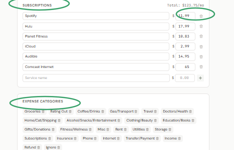
Form labels everywhere: Every input, select, and filter now has a proper <label> with htmlFor association — including Settings budget targets, subscription fields, balance snapshot inputs, and inline category edits. No more placeholder-only inputs.
Chart accessibility: Added screen-reader-only data tables as alternatives for all three Recharts visualizations. Chart containers have role="img" with descriptive aria-label attributes so assistive technology can convey the chart's purpose.
Keyboard navigation: The account filter dropdown now supports Arrow Up/Down, Home/End, Enter/Space to select, and Escape to close — with proper role="listbox", role="option", and aria-selected attributes.
Screen reader support: Added a skip-to-content link, aria-live="polite" on the transaction counter, proper tab navigation ARIA (role="tablist", aria-selected, aria-controls), and aria-hidden="true" on all decorative icons.
Before & After
Original olive green/muted rose colors were difficult to distinguish for users with protanopia or deuteranopia. Updated to teal and wine for clear separation across all common types of color vision deficiency.
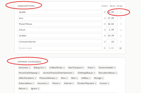
Settings previously relied on low-contrast placeholder text with no visible labels. After: proper labels, higher-contrast text, clearer hierarchy.
Remaining Work
- Recharts elements themselves are not keyboard-navigable (library limitation) — the sr-only data tables serve as the workaround
- No hands-on screen reader testing (NVDA, JAWS, VoiceOver) has been conducted yet
Phase 2: Cloud Platform
The offline tool solved my problem, but my partner and I share finances — two separate localStorage budgets on two machines meant we were always out of sync. The challenge: add multi-user support without losing what made the tool work.
Architecture
The key decision: preserve the original data shape at the boundary. A cloud adapter translates between the localStorage format and Supabase — so all 17 existing components required zero changes.
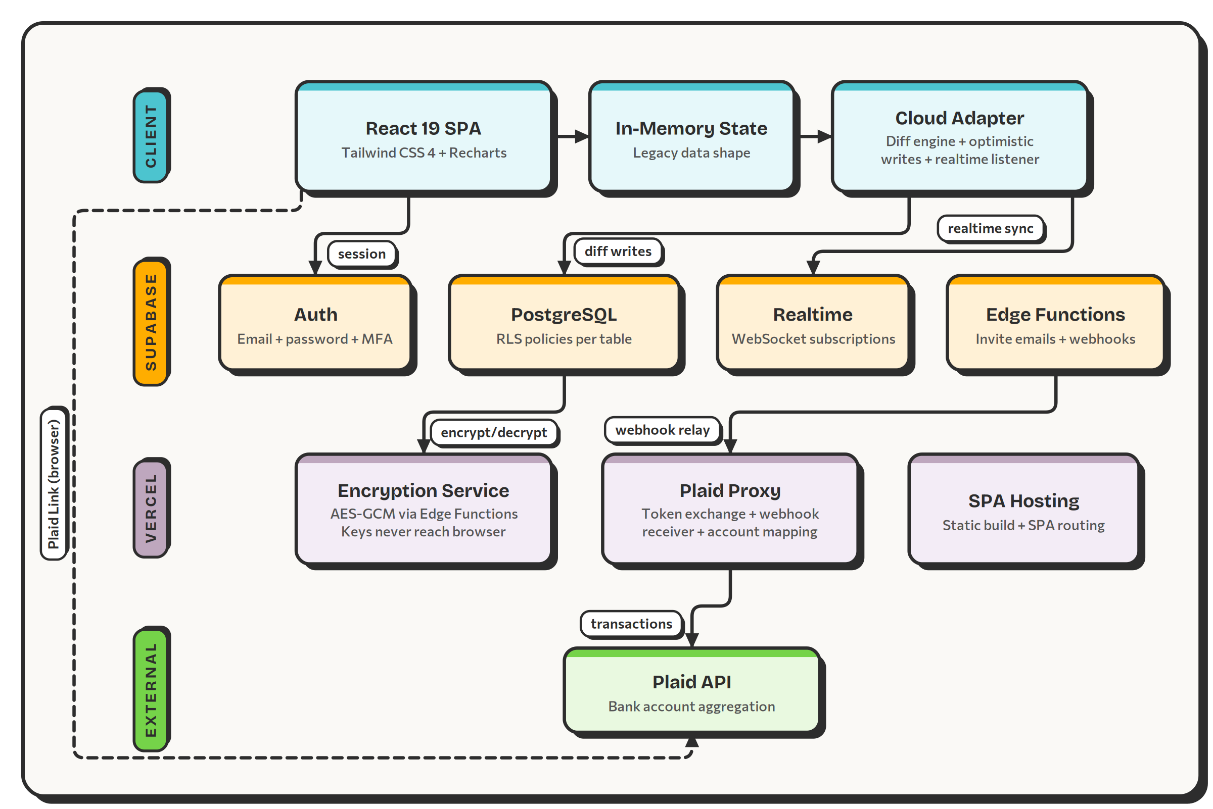
Key Technical Decisions
Legacy shape preservation: All components read/write the same in-memory object as the offline version. A cloud adapter translates at the boundary — zero UI refactoring required.
Optimistic updates: The UI applies changes immediately. Cloud sync fires in the background. Supabase Realtime reconciles if drift occurs.
End-to-end encryption: Transaction amounts, descriptions, and balance snapshots encrypted at rest (AES-GCM). Keys managed by Vercel Edge Functions — never exposed to the browser.
Granular diff sync: A diffing engine compares previous and current state — only inserted, deleted, or modified rows hit the database.
Row-Level Security: Every Supabase table enforces ownership and membership checks via PostgreSQL RLS policies — not client-side gatekeeping.
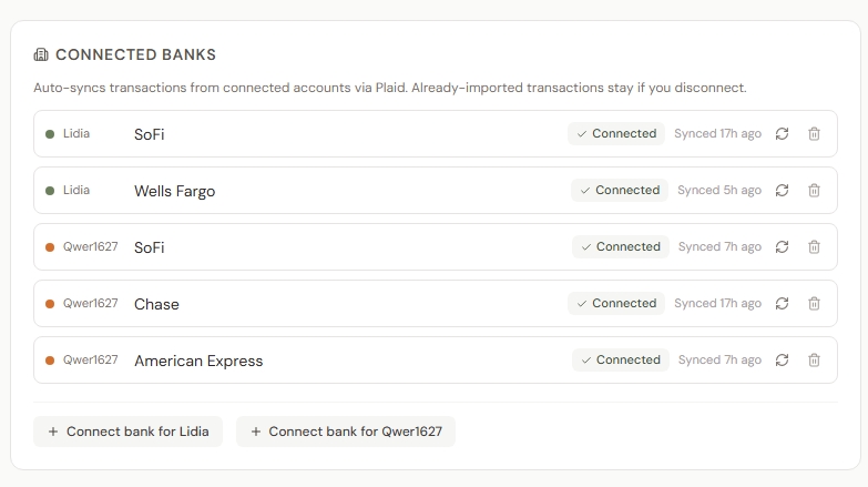
Plaid integration: Bank accounts connect via Plaid Link. Access tokens exchanged server-side. Transactions sync automatically with webhook-driven updates.
Tech Stack
Household View Modes
Single: One member's data in isolation.
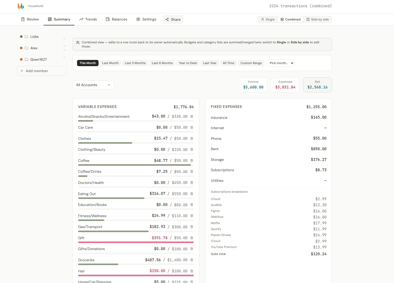
Combined: All members merged — categories summed, transactions color-coded by owner.
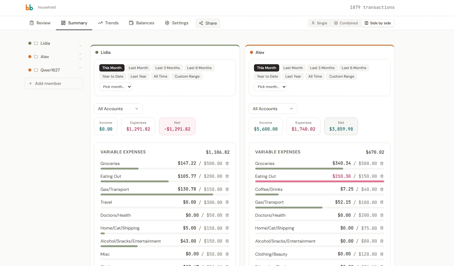
Side-by-Side: Each member in their own column for direct comparison.
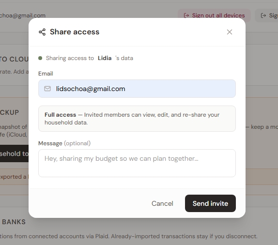
Sharing & Permissions
Email-based invitations with toggleable permissions (view, edit, re-share). Magic-link accept flow via Supabase Edge Functions.
Bank Integration via Plaid
Plaid eliminates CSV imports entirely. Members connect bank accounts, map them to household accounts, and transactions sync automatically.
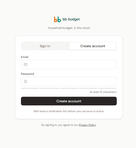
Authentication & Security
Supabase Auth with email verification and password reset. A 30-minute inactivity timer auto-locks sessions. All sensitive data encrypted at rest (AES-GCM) with keys managed server-side.
Outcomes
Reflection
What I Learned
- Being the daily user changes everything. Every friction point I hit became a feature — auto-categorize, "mark all reviewed," the progress bar. Nothing stays broken when you use the tool yourself.
- Accessibility assumptions need auditing. I assumed my minimal layouts were accessible. A real audit found six gaps. Fixing them taught me more than any checklist ever could.
- Design data boundaries before writing UI. Preserving the localStorage data shape at the cloud adapter boundary meant zero component refactoring — the hardest architectural decision saved the most time.