Our Light Unbound
Brand identity and a full promotional campaign — event flyers, social graphics, and event collateral — for a month-long community art exhibition, paired with an accessible, mobile-first digital catalogue. A cohesive visual system carried across formats, from Instagram to the gallery wall to the phone in every visitor's hand.
View Live Site →
Overview
"Our Light Unbound" was an art exhibition I co-curated with Yaz (they/them) over 18 months of planning, running January 9–31, 2026 at Slip Gallery in Seattle. I led the promotional campaign design, workshop scheduling, and the digital catalogue; Yaz led merch design and the core visual identity, which we shaped together.
Design Decisions
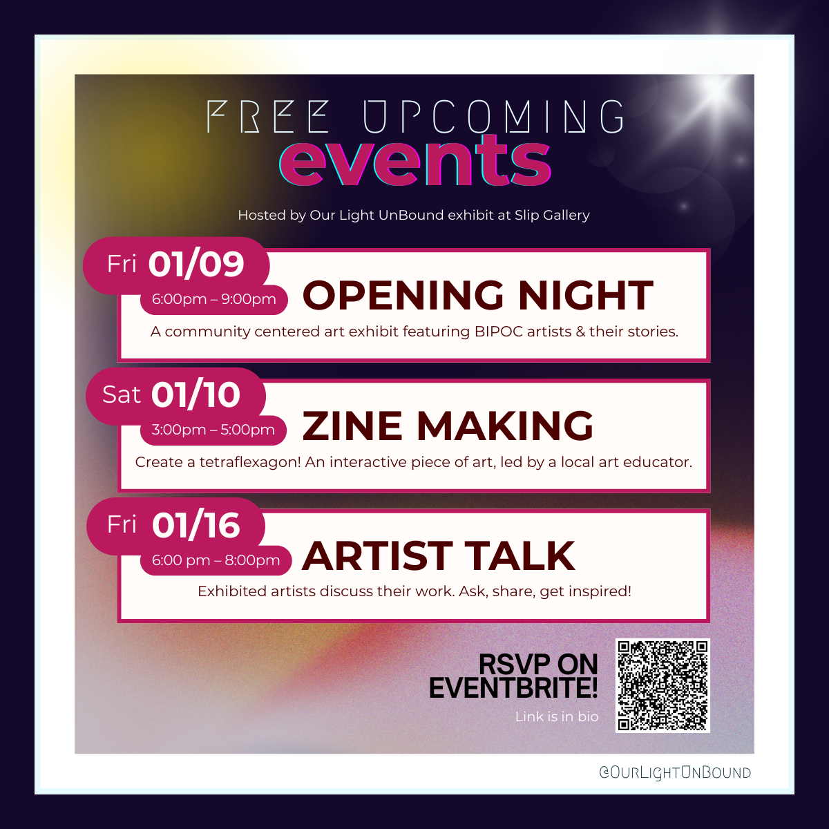
Campaign system
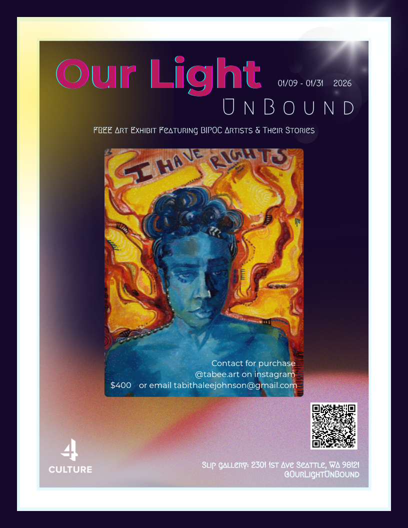
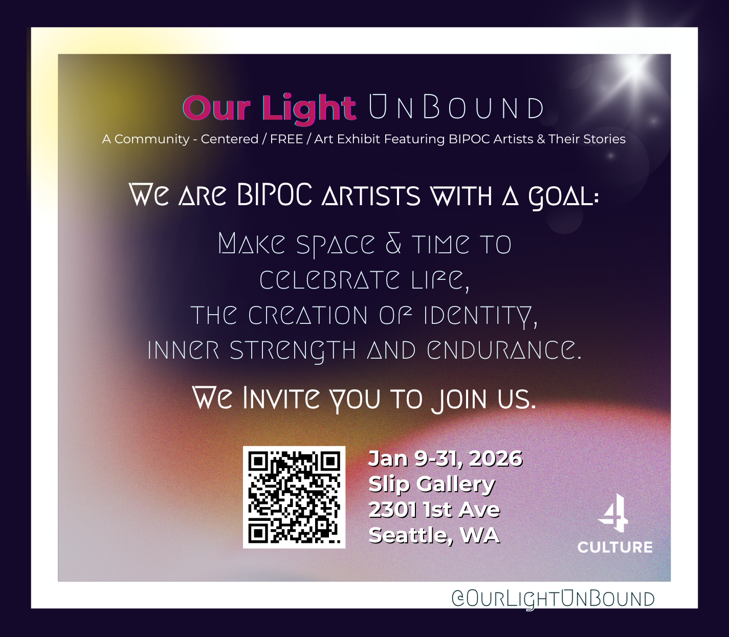
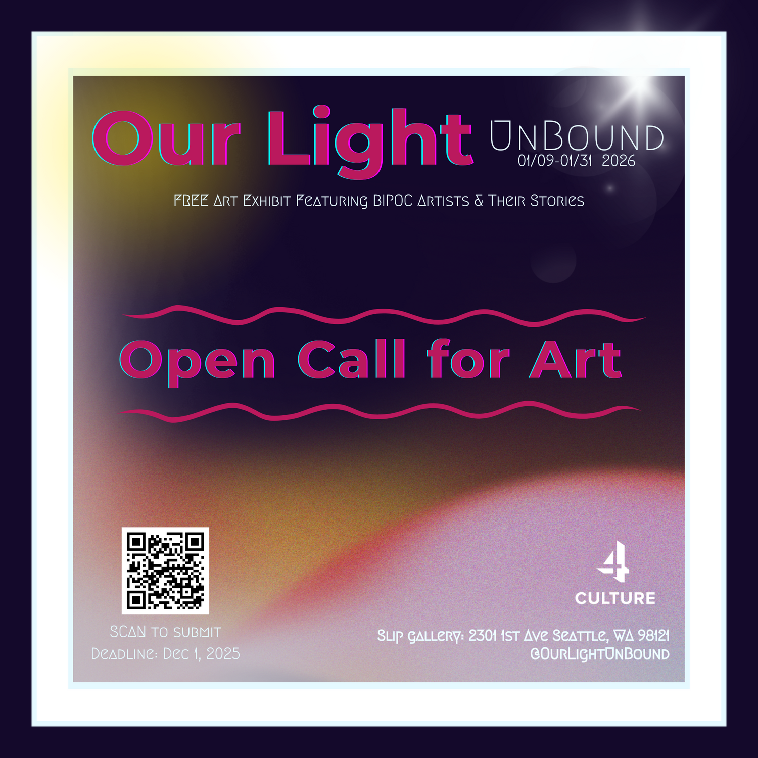
One system, many formats: a single wordmark, palette, and type treatment carried across portrait, square, and landscape layouts so the show was instantly recognizable wherever it appeared.
Legibility on dark, atmospheric art: high-contrast headline type and restrained body copy over rich gradient backgrounds keep details readable on a phone screen or a printed flyer alike.
Always a next step: every asset pairs a clear call to action with a QR code, turning a glance into an RSVP, a catalogue scan, or a gallery visit.
Dark theme strategy
The deep purple (#1a0a2e) background with gold (#d4a537) accents was chosen to feel luxurious and gallery-like. Dark themes require deliberate contrast work — I tested every text/background combination against WCAG AA, using lighter purples and off-whites for body text to avoid eye strain. Gradient overlays on the hero use semi-transparent layers so text stays legible regardless of the image underneath.
Information architecture
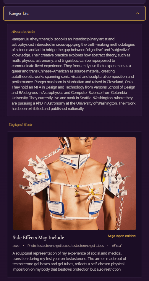
The core question was compactness: how do you present a full exhibition's worth of artists, bios, and artwork descriptions without overwhelming visitors? The artist accordion collapses content by default for scannable browsing, then expands to reveal bios and exhibited pieces — functioning as both a digital catalogue and an exhibition guide.
Search
A prominently placed search bar filters artists and artworks in real time, sitting between the exhibition statement and the catalogue to follow the natural reading flow: context first, then discovery.
The Work
Campaign & Promotion
I designed the exhibition poster, landscape ad, social graphics, and event-series collateral — all built from the shared brand system Yaz and I developed together.
Click any piece to see it full size with design notes.
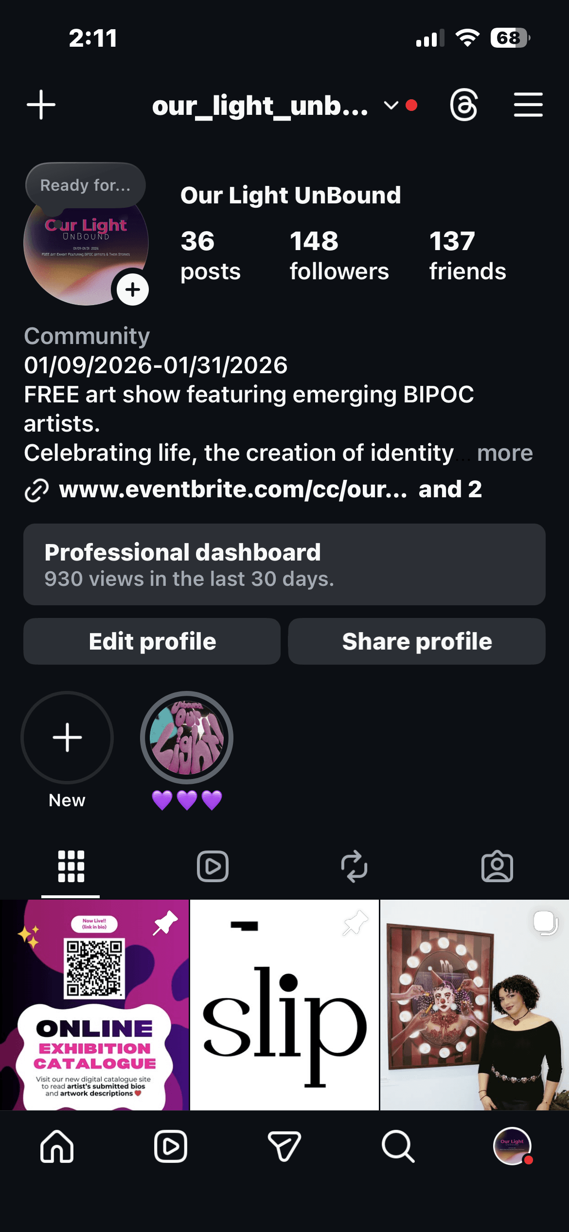
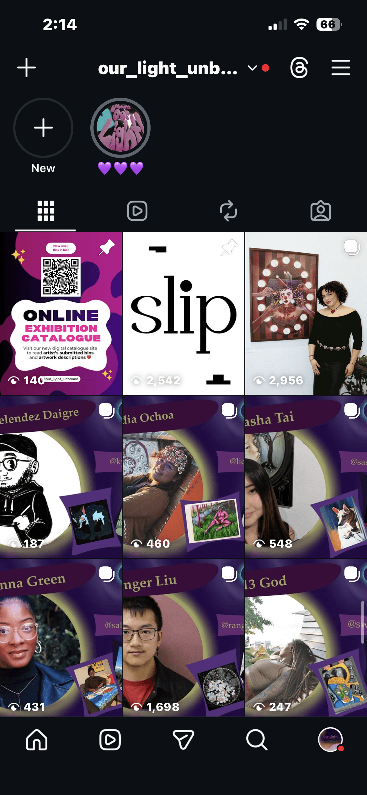
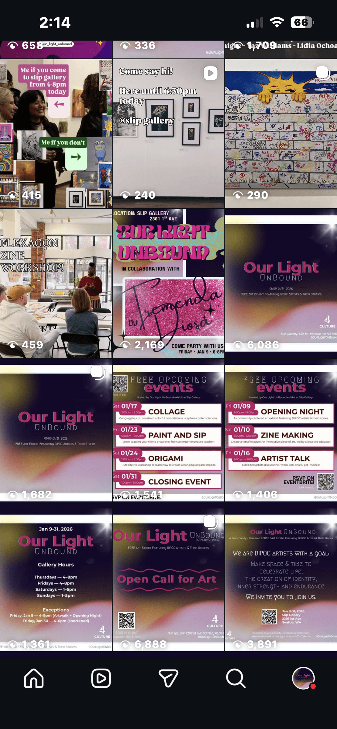
Community & Social Media
The @our_light_unbound Instagram account served as the exhibition's main outreach channel — artist shoutouts, event promotion, and the digital catalogue launch. By opening night: 36 posts, 148 followers, and a reel that reached 2.5K views. We cross-promoted with the gallery, partnered businesses, and artists' own platforms.
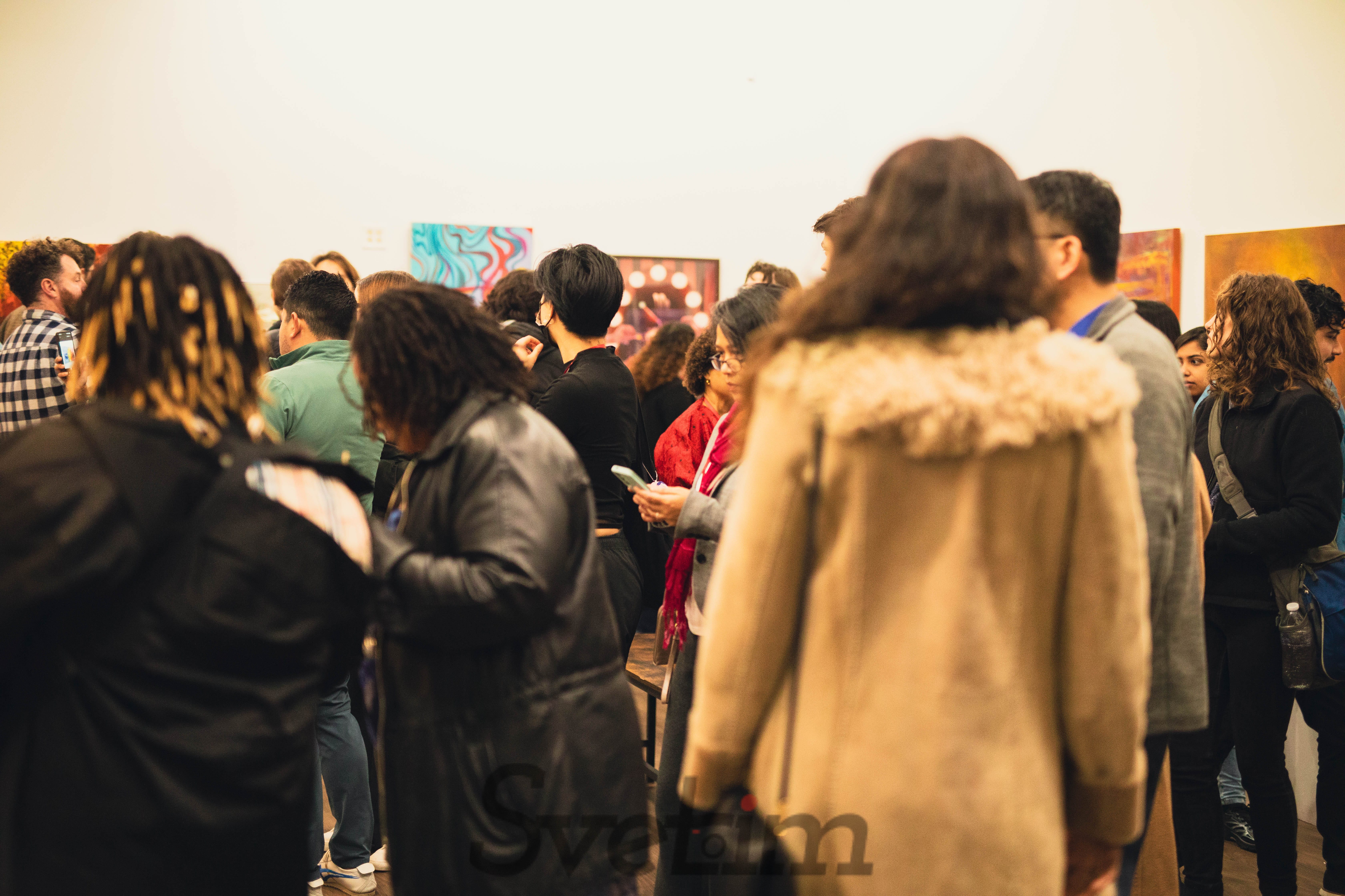
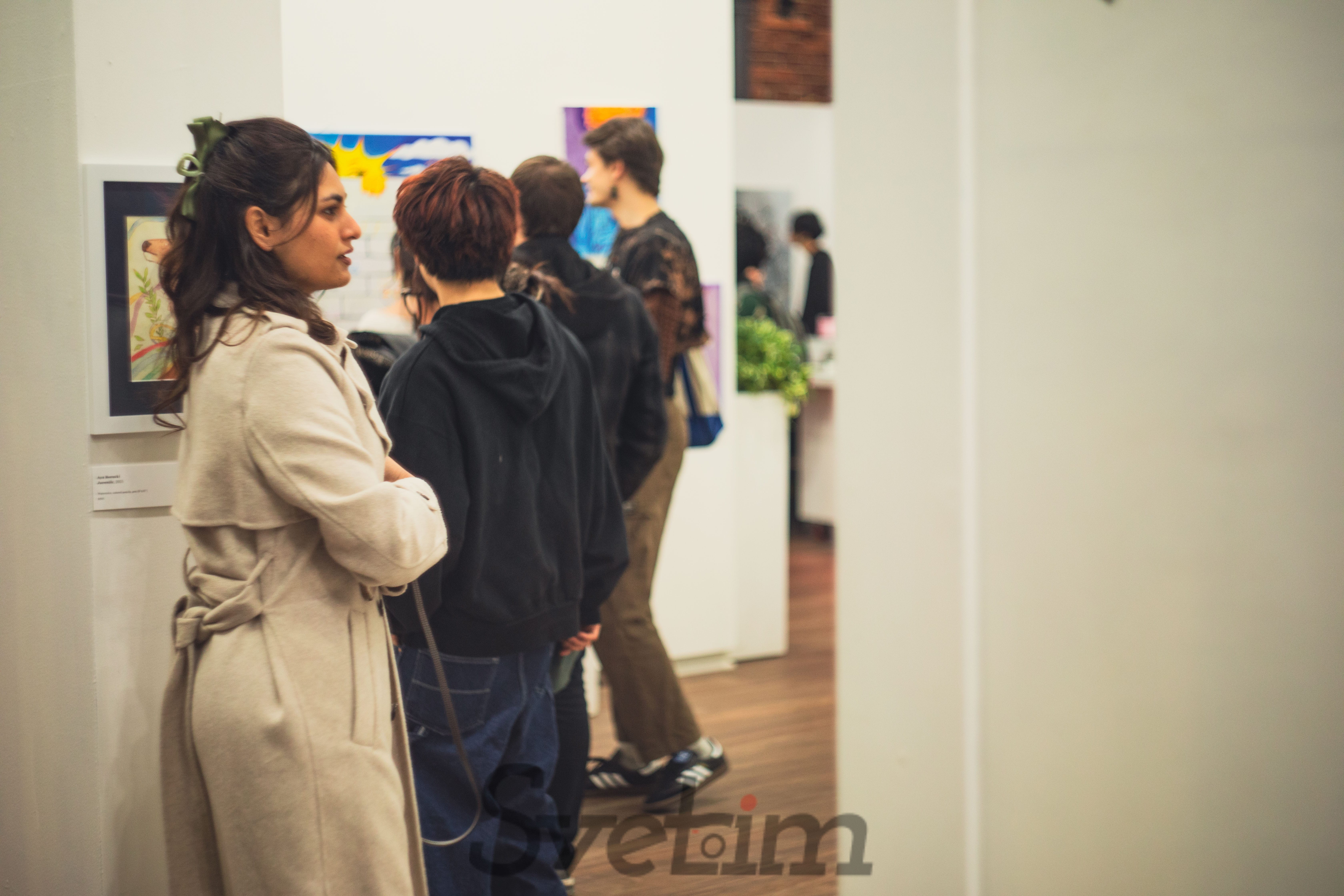
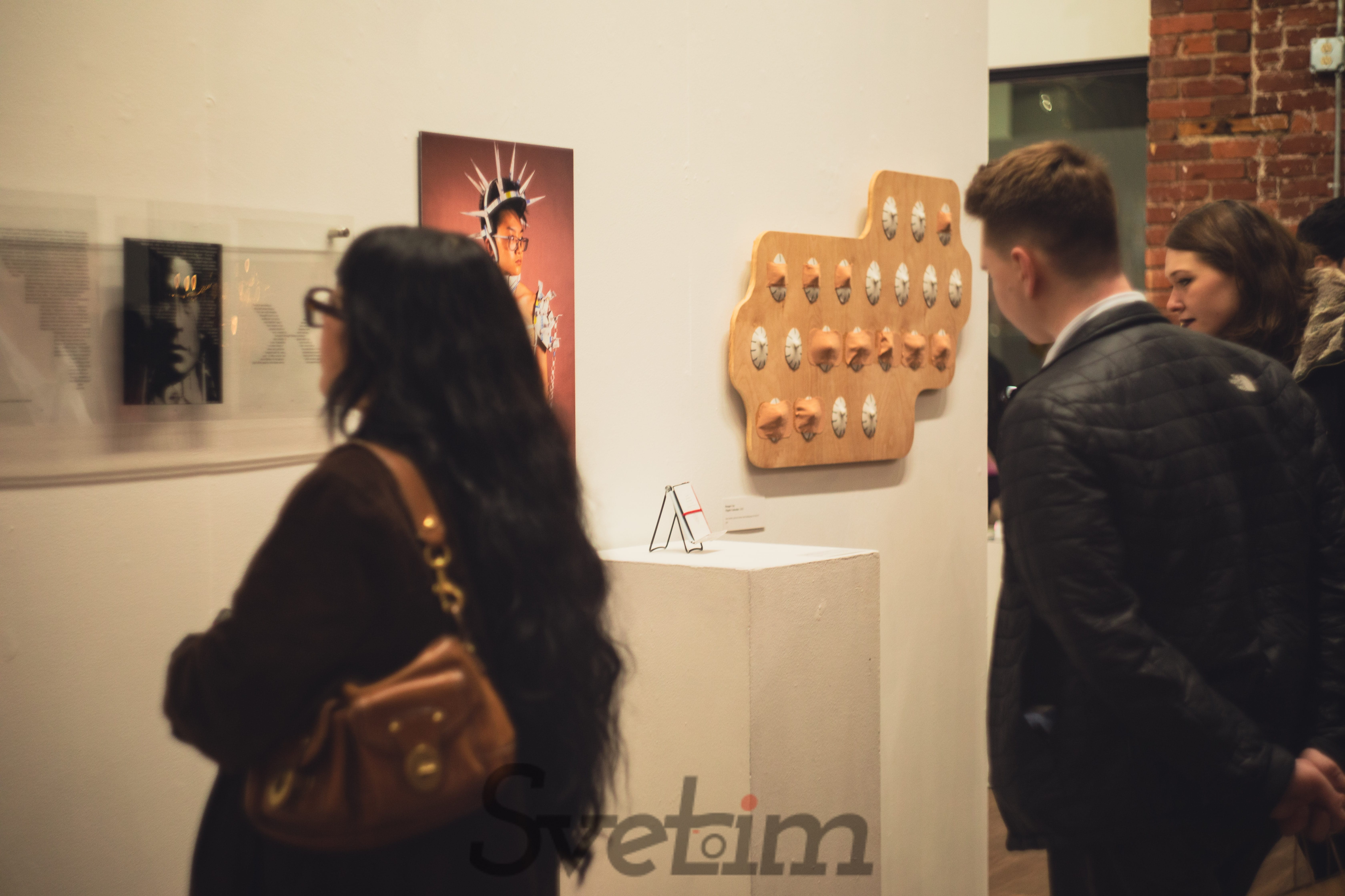
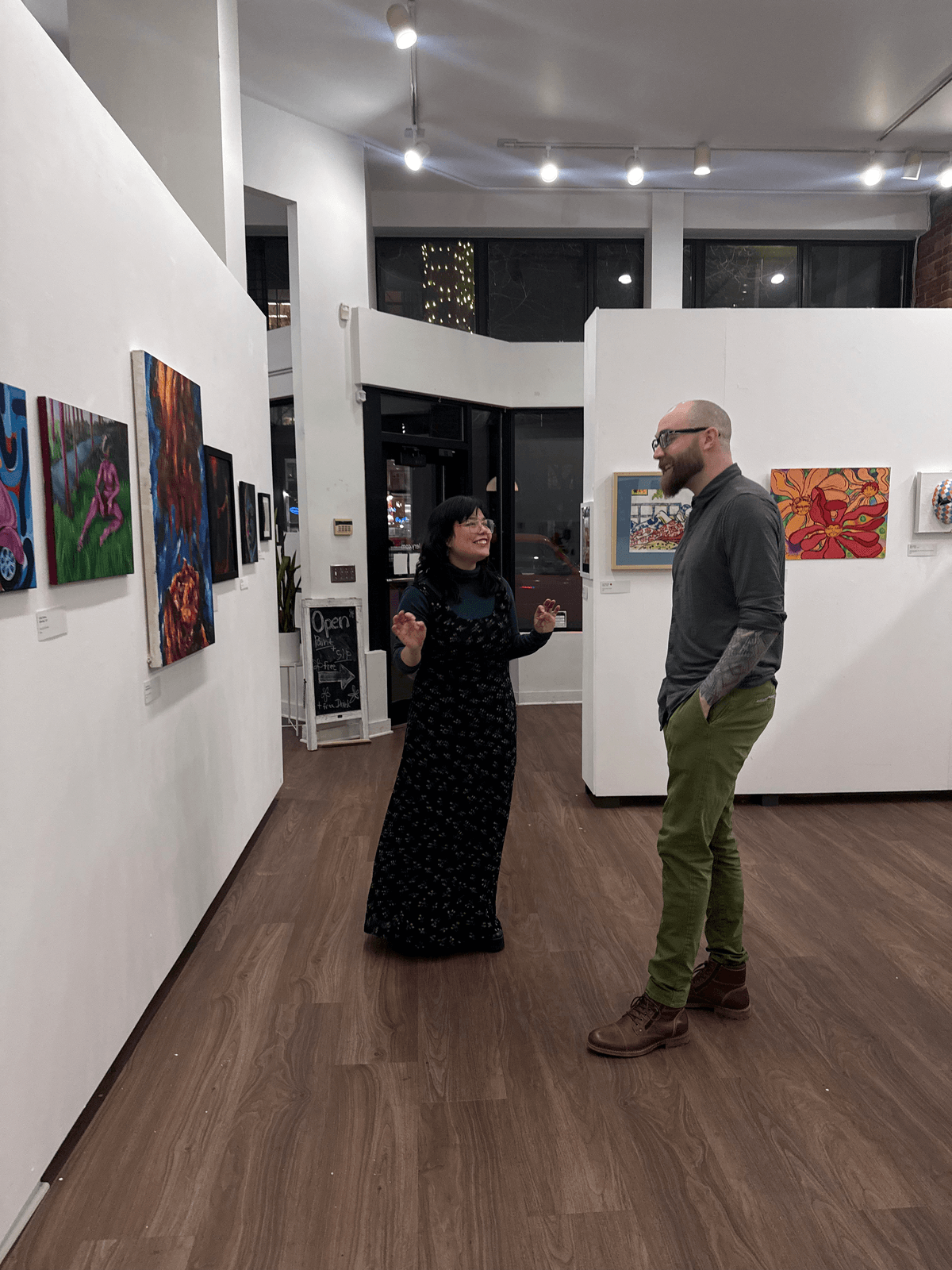
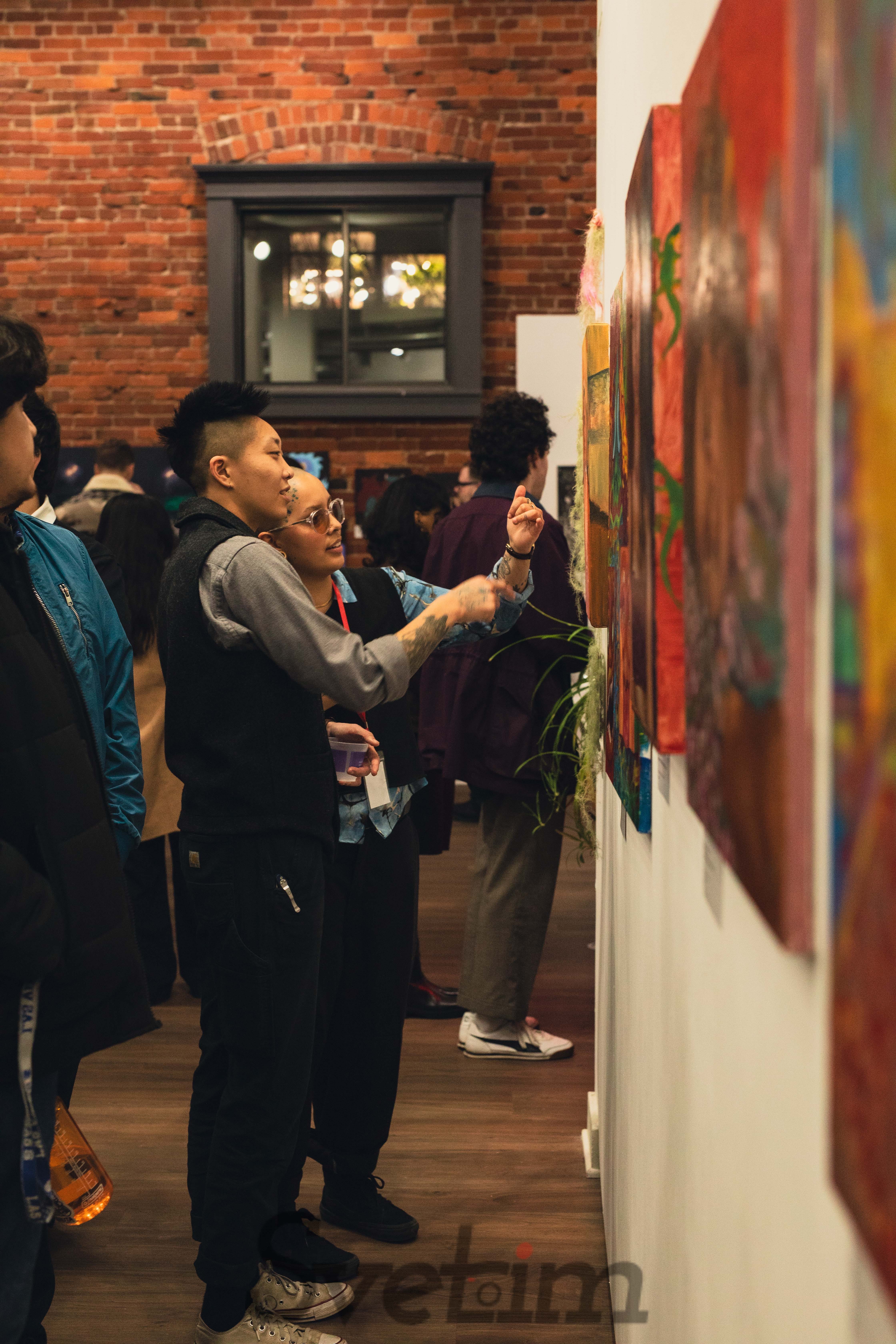
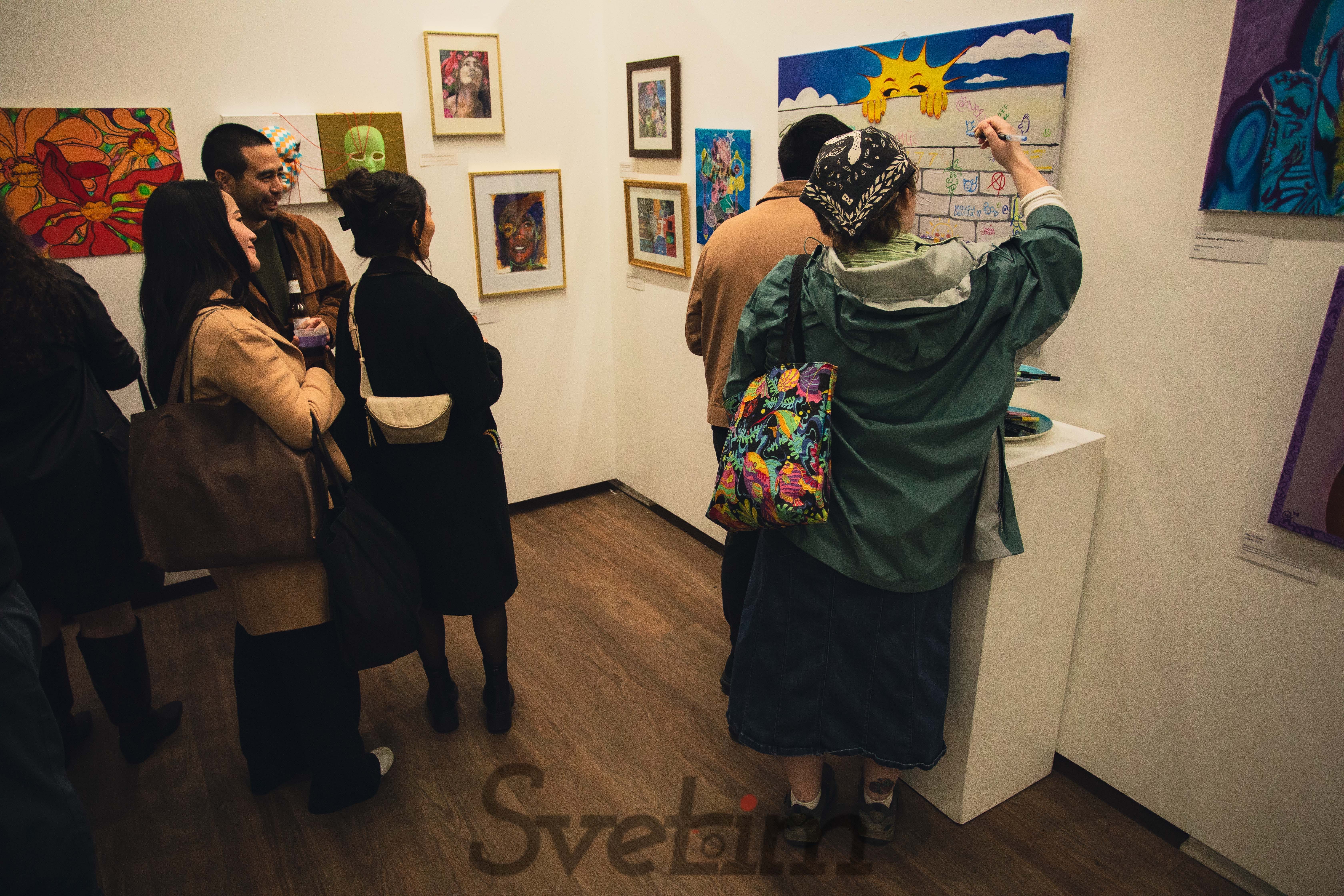
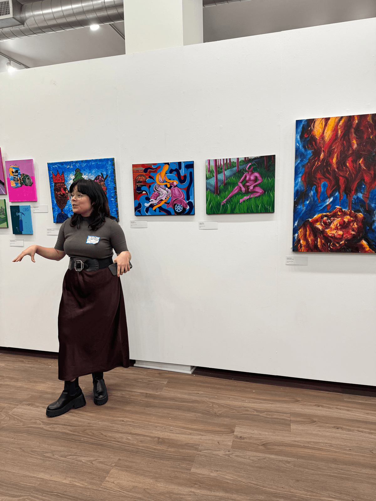
The Exhibition
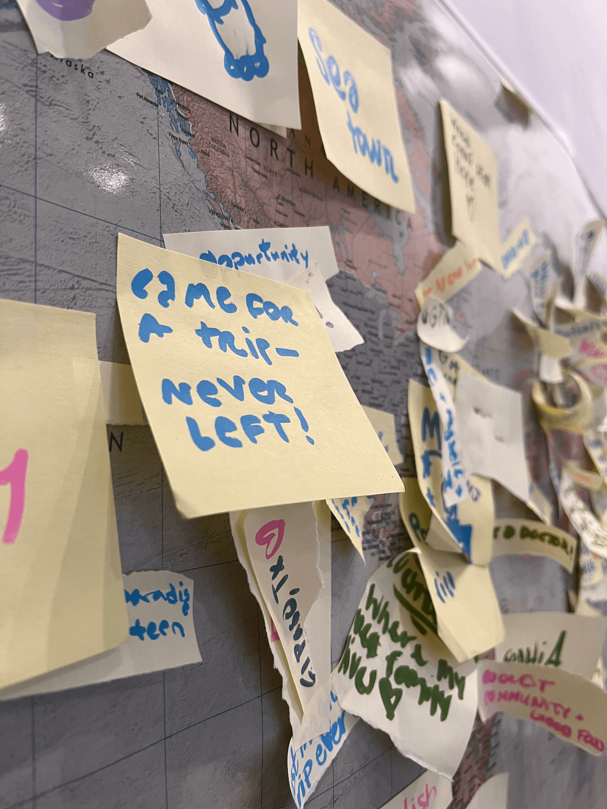
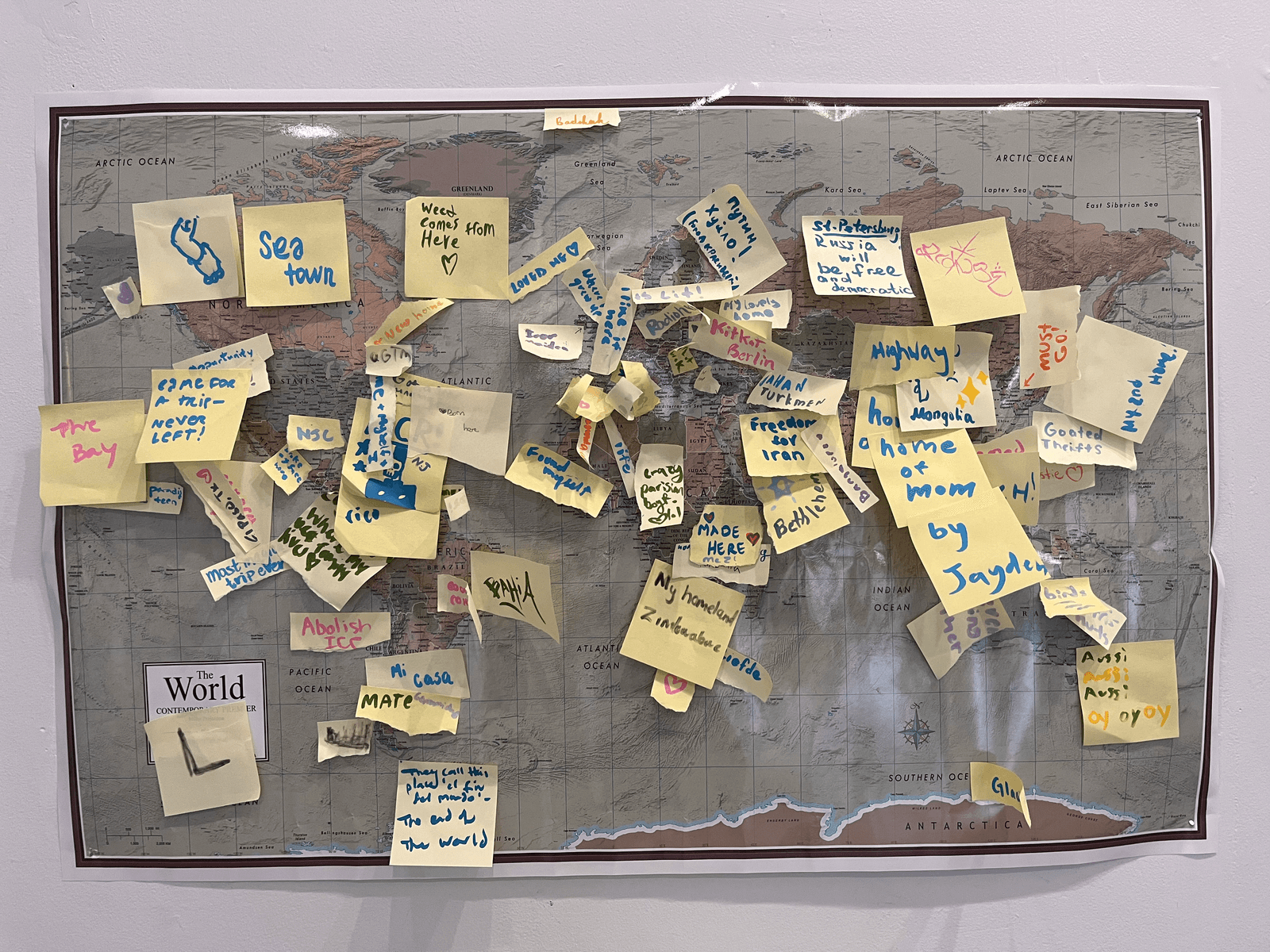
The show opened January 9 at Slip Gallery in Belltown, Seattle. An interactive world map invited visitors to pin where they were from and leave a note — turning the gallery into a gathering place, not just a viewing space.
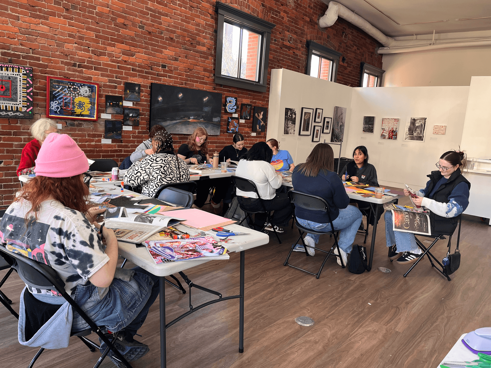
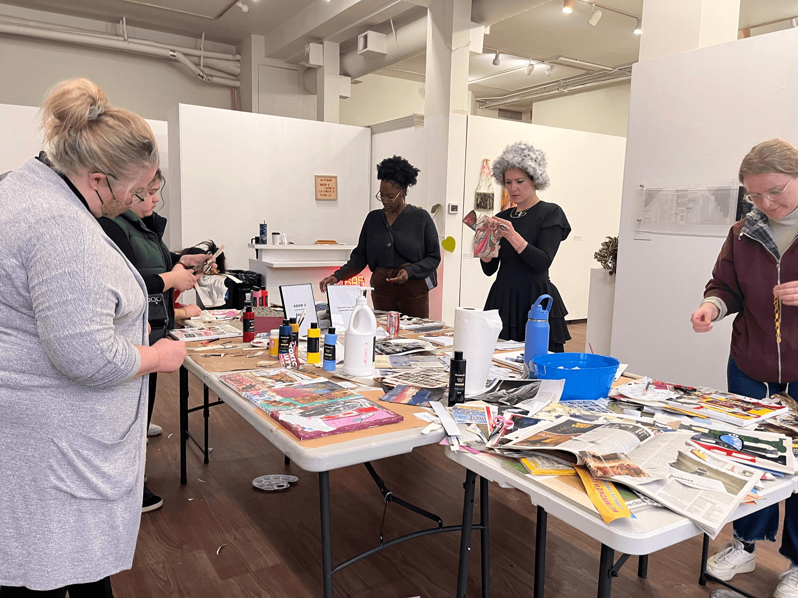
Workshops & Events
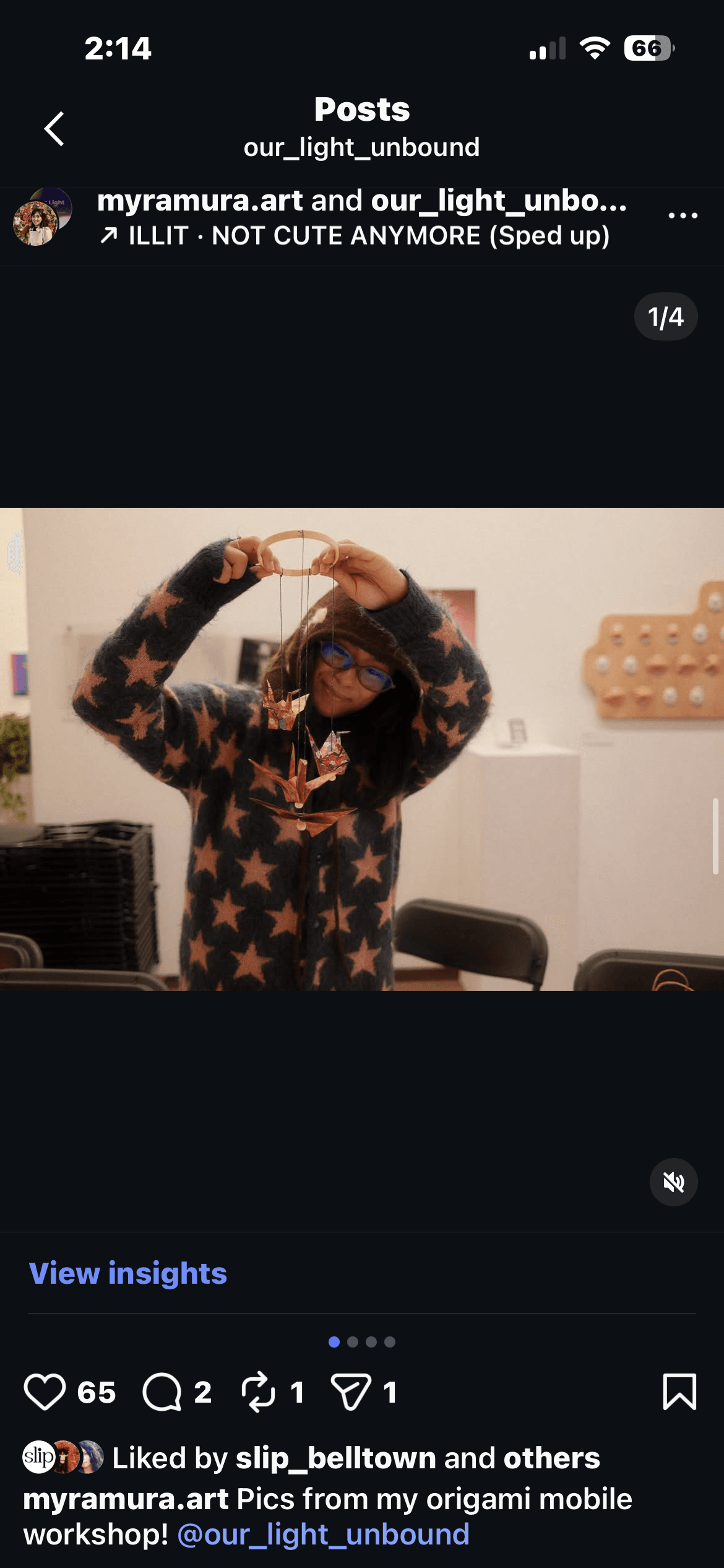
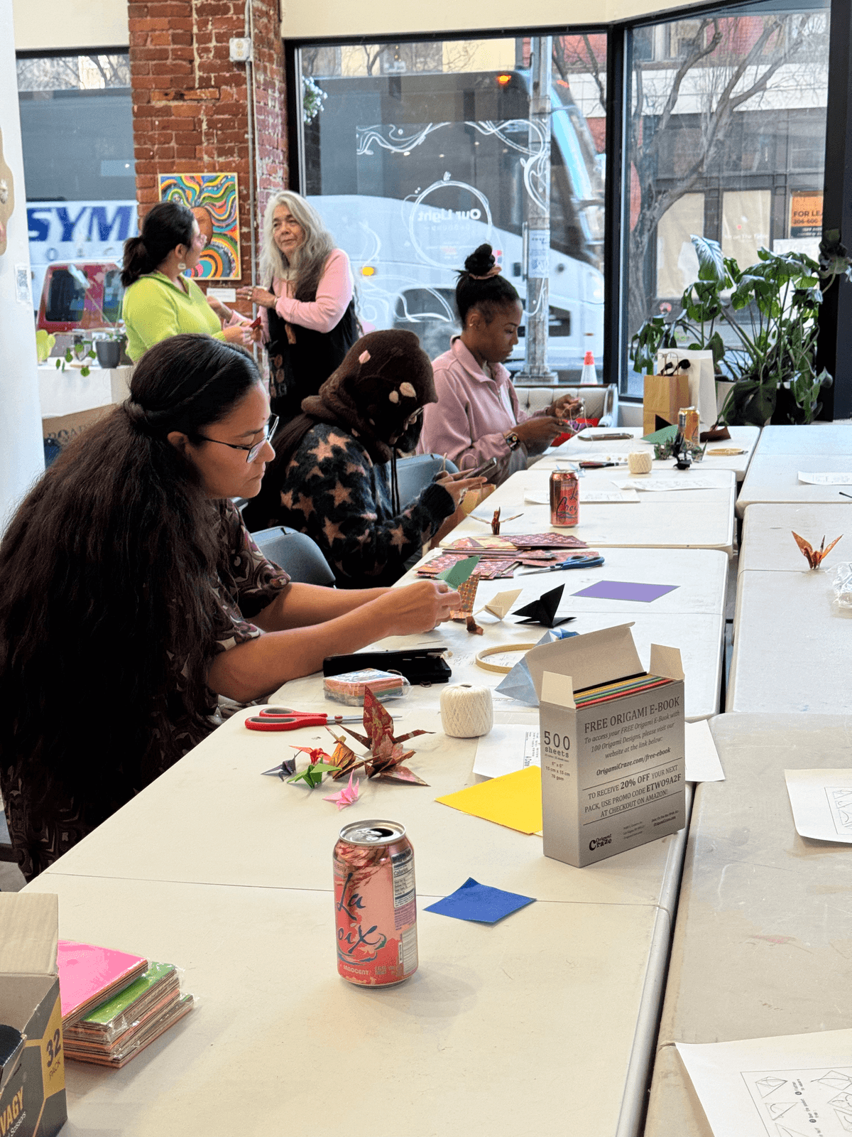
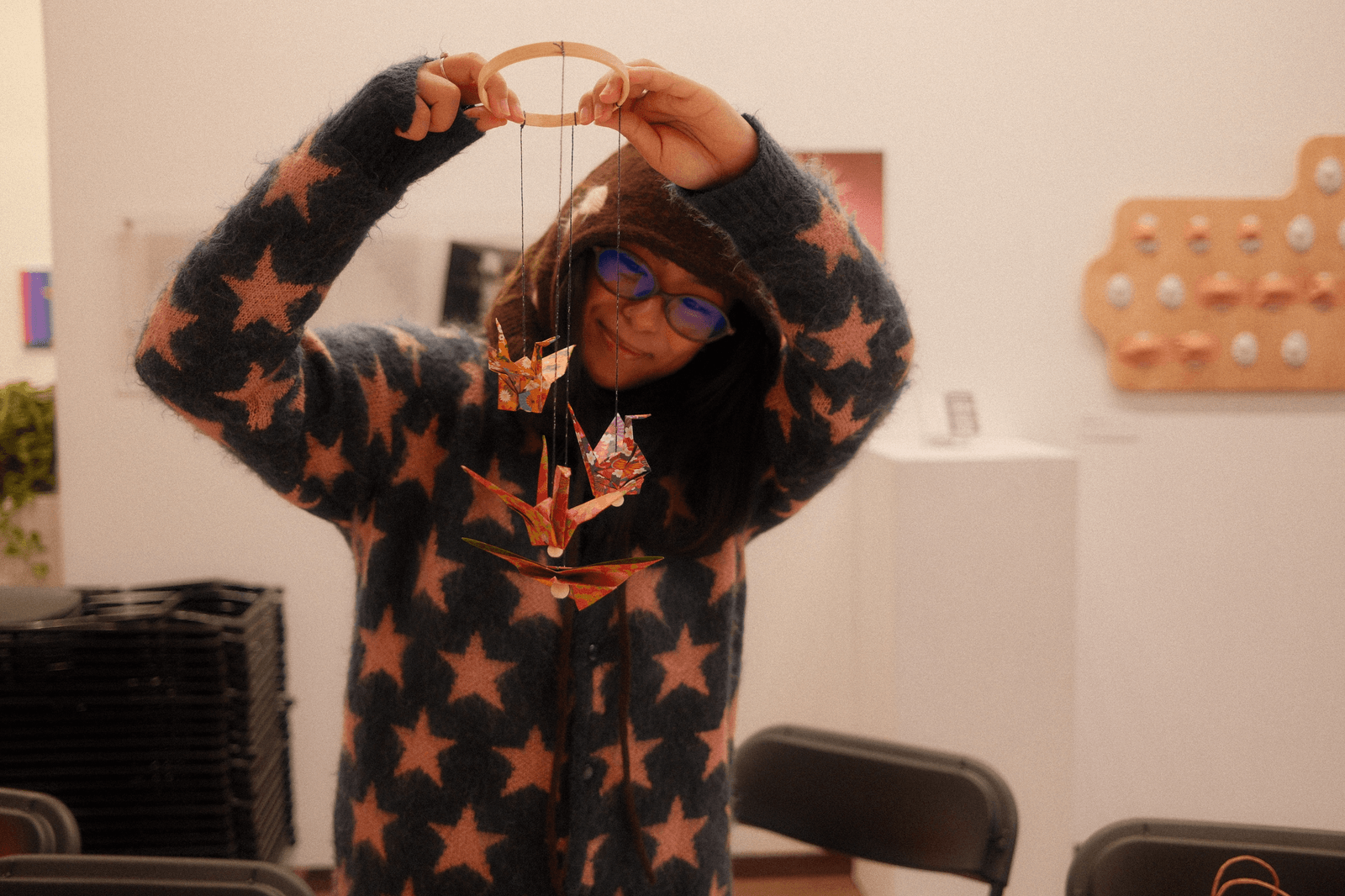
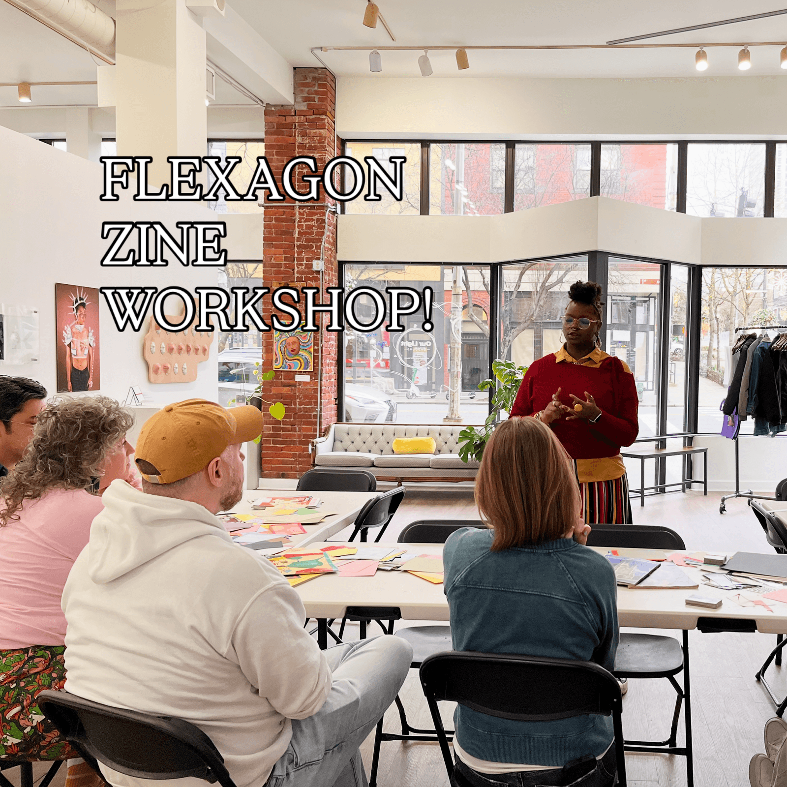
Throughout the month we hosted workshops — collage, paint and sip, origami mobiles, flexagon zines — and an artist talk, turning the gallery into an active creative space rather than a static display.
Click an image to see it full size with details.
The Digital Catalogue
Designed mobile-first for visitors scanning a QR code at the gallery entrance. The deep purple and gold palette evokes twilight and candlelight, creating warmth within darkness. An accordion-style catalogue organizes works by artist with expandable bios and artwork descriptions — optimized for one-handed phone browsing.
Key Navigation Elements
Gallery Hours — immediately accessible via a prominent button, because the most common question for any exhibition site is "when can I visit?"
Upcoming Events — surfaces exhibition-related events and programming beyond the static gallery experience.
Contact for Purchasing — a direct path for buyers, separated from general inquiries to reduce friction for the gallery's most valuable interaction.
Accessibility
The digital catalogue removes physical barriers — crowded wall text, small print, limited viewing space — but the dark theme introduced its own challenges. The aesthetic could never come at the cost of usability.
Contrast on dark backgrounds: Gold headings on deep purple tested above 4.5:1. Body text uses lighter tones (#e0d0f0) to reduce strain while maintaining readability.
Focus visibility: Custom focus outlines using the gold accent color — highly visible on dark backgrounds, unlike browser defaults which often disappear on dark themes.
Accordion semantics: Artist sections use proper expand/collapse patterns with aria-expanded, so screen reader users know which sections are open and can navigate the catalogue efficiently.
Search accessibility: Live search results announced via aria-live region, labeled input, and keyboard-navigable results — no mouse required to find an artist.
Outcomes
The exhibition ran for the full month of January 2026 at Slip Gallery in Seattle.
Reflection
- Planning makes the creative work possible. Co-curating over 18 months taught me that timelines, shared drives, and clearly divided responsibilities are what let the design happen — building in buffer time and trusting your collaborator's strengths leads to stronger outcomes.
- Accessibility reframes physical spaces. Printed artist statements are so standard in galleries that their limitations are invisible — small text, crowded walls, inaccessible to visitors with low vision. Replacing them with a searchable, resizable digital format was fundamentally more inclusive, and the dark theme's constraints forced better design decisions.
- Collaborative content is better content. The catalogue is stronger because the artists shaped it — receiving bios and descriptions in their own words deepened my respect for letting contributors own their voice.