ComBoard
AAC app for a non-speaking high school student with cerebral palsy, used in mainstream classes.
View Prototype →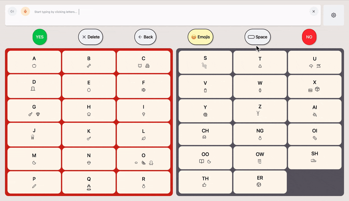
Understanding Users
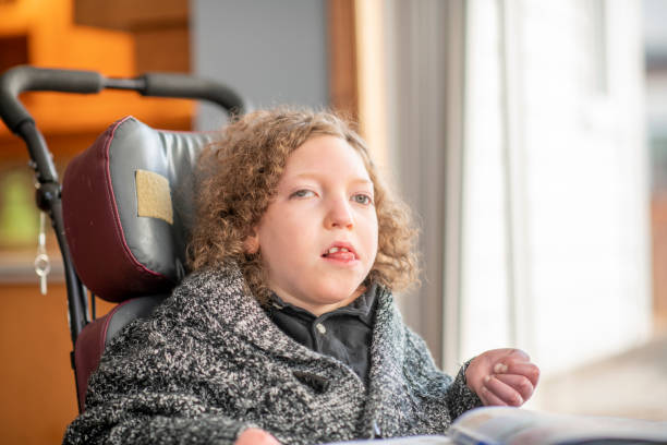
This is 16 year old Ellie. She communicates primarily with left-right eye movements and interpretation support from an adult aide. Existing AAC solutions cause eye strain and exacerbate social friction. A personalized, pocket-sized, predictive, eye-tracking app would boost spontaneous, independent communication, allowing her to connect socially and learn without barriers.
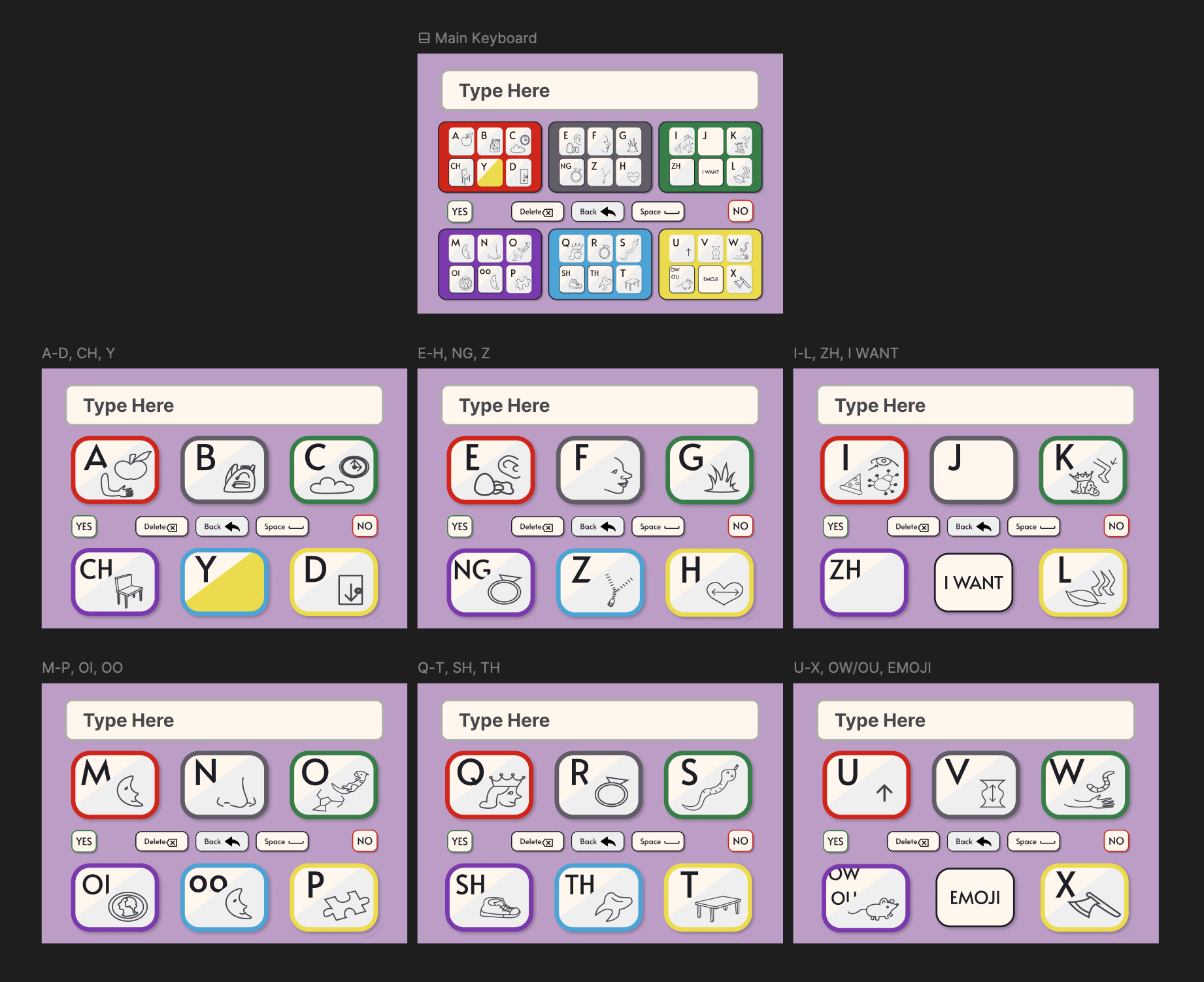
A sneak peak into how the design helped Ellie!
Journey Map
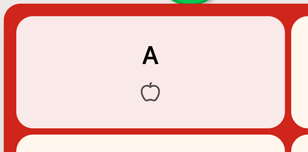
Communicate a Thought
Ellie is frustrated and exhausted by current communication methods that further create distance between her and her aspirations. She wants to communicate independently and in real time.
- Tasks
- Feels the need to ask a question or share an idea; signals with eye movements or gesture
- Feeling
- Urgent, Anxious
- Improvement
- Always available AAC that allows self initiation
- Tasks
- Wait quietly; vocal noises to get attention
- Feeling
- Helpless, Dependent
- Improvement
- Visual or audio cues built into app to alert when she has something to say
- Tasks
- Aide interprets intent through body language and eye gaze; possibly set up bulky Tobii or plexiglass E-TRAN
- Feeling
- Embarrassed, Impatient
- Improvement
- Smart, predictive text
- Tasks
- Tobii blocks Ellie's face, E-TRAN is unwieldy; limited to aide-proposed options
- Feeling
- Frustrated, Excluded
- Improvement
- Eye-tracking technology; use of common device screens that don't block face
Defining the Challenge
How might we design an AAC app that minimizes eye strain, integrates AI for predictive text and smart gaze tracking, and adapts to the unique needs of the individual so that they can communicate efficiently and independently without obscuring their face?
Accessibility Decisions
Key Research Insights and design decisions arrived at through recurring user interviews and a competitive audit of available AAC tools.
User Constraints
- Communication boards have limited word categories and lack spelling options for free expression.
- Many devices are cluttered and require fine motor control, causing eye strain.
- Many devices limit social interaction by blocking the user's face and view.
Design Decisions
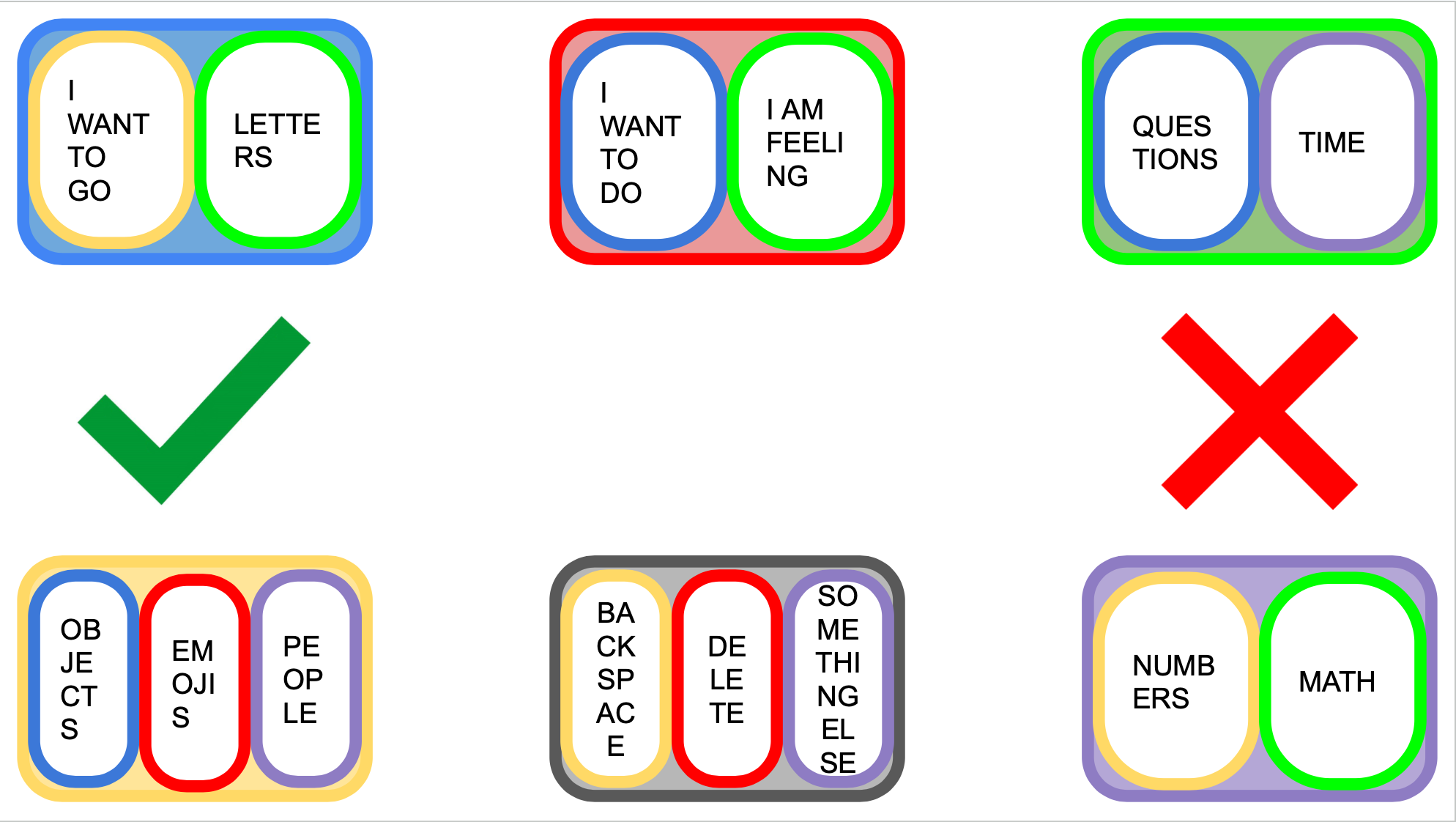
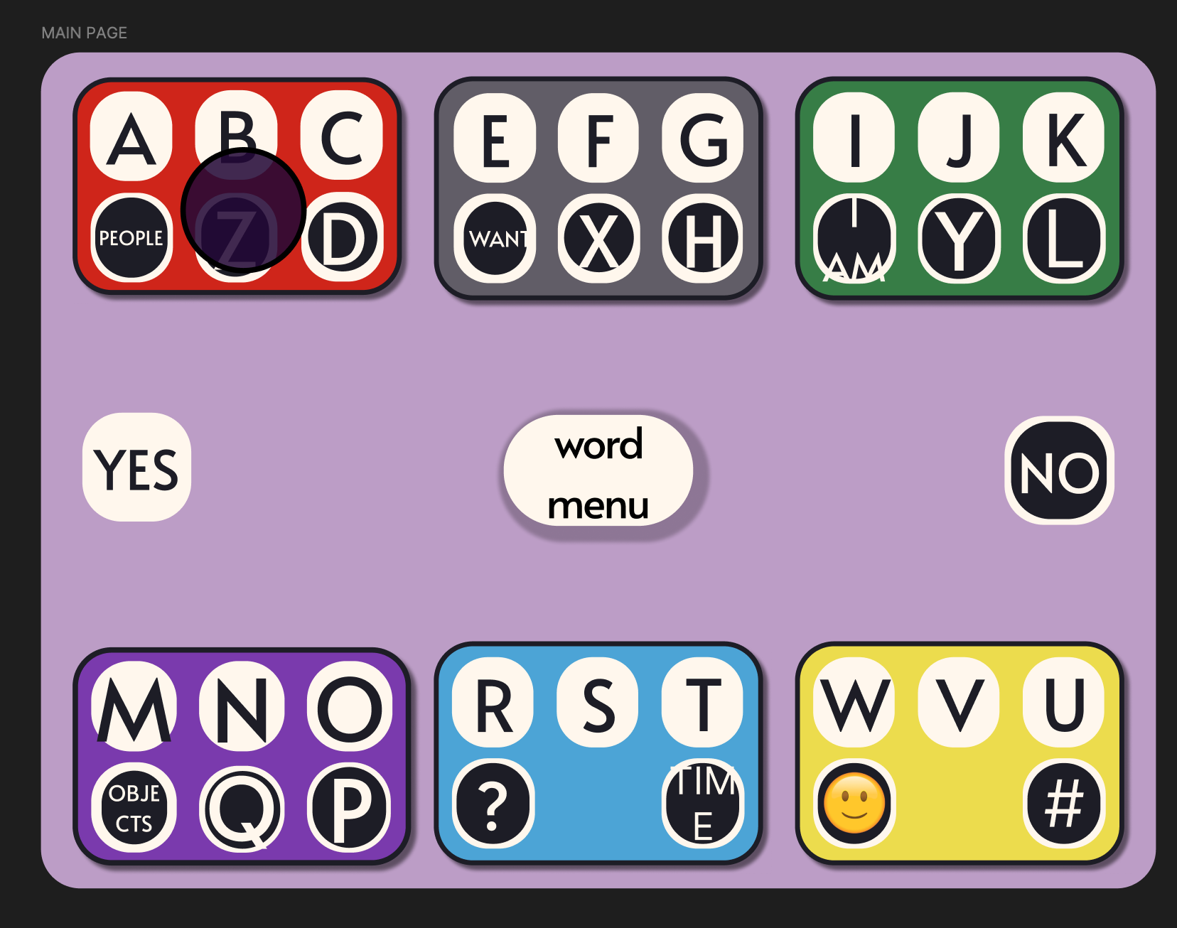
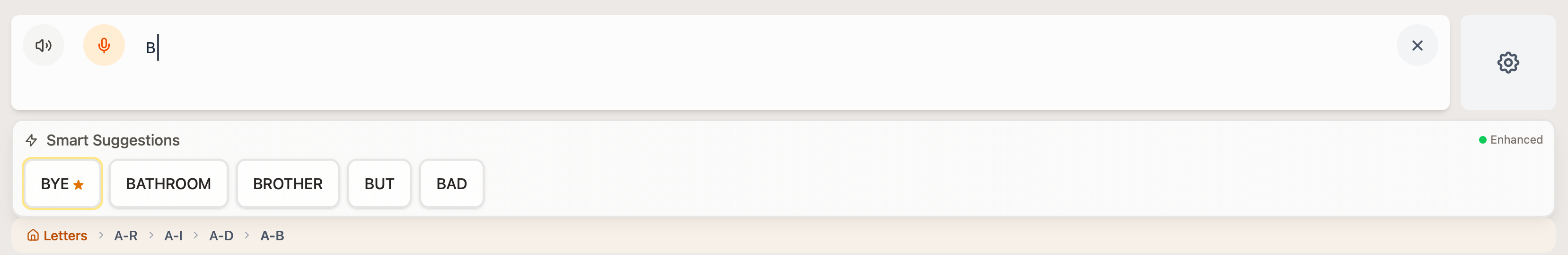
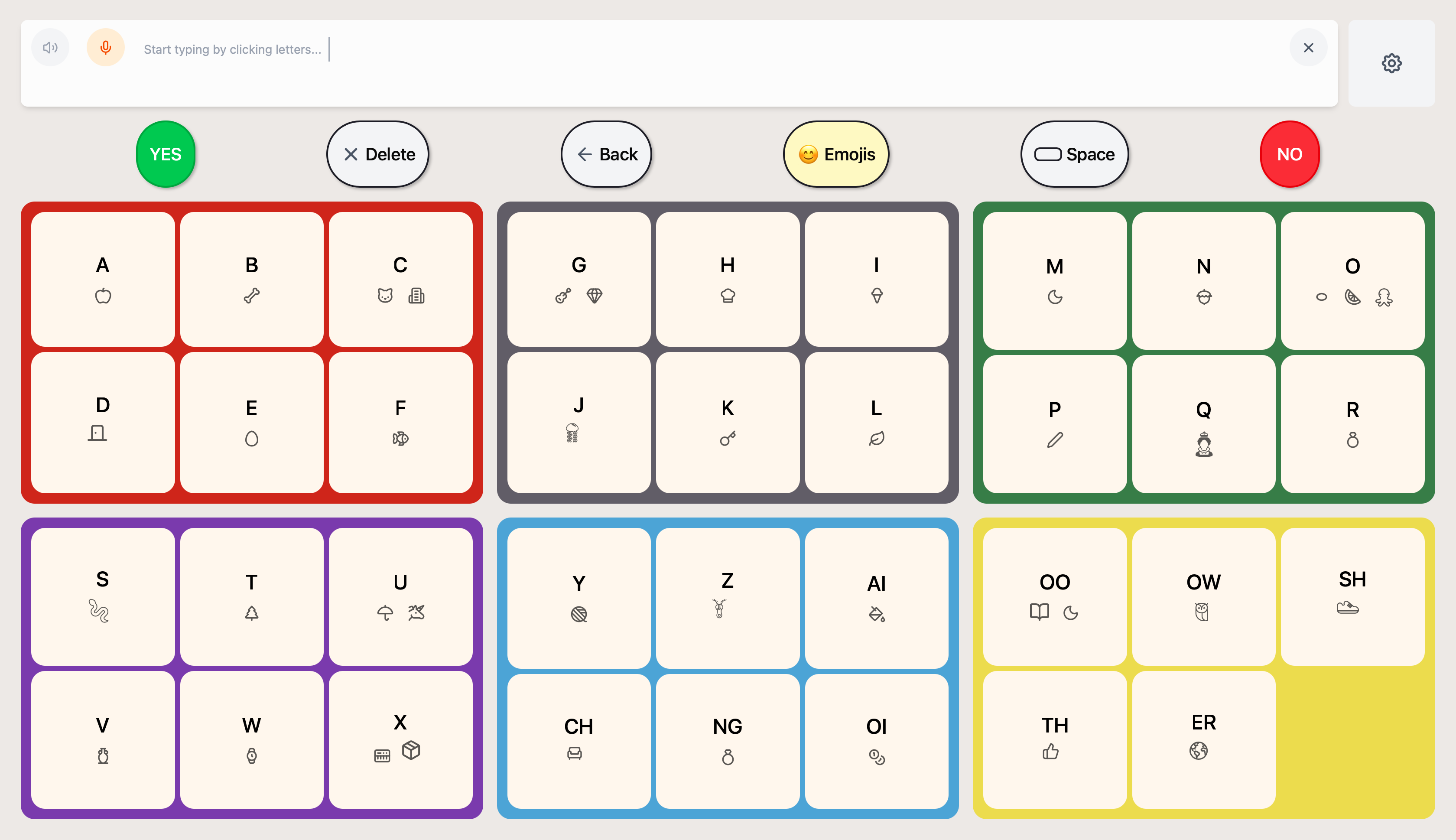
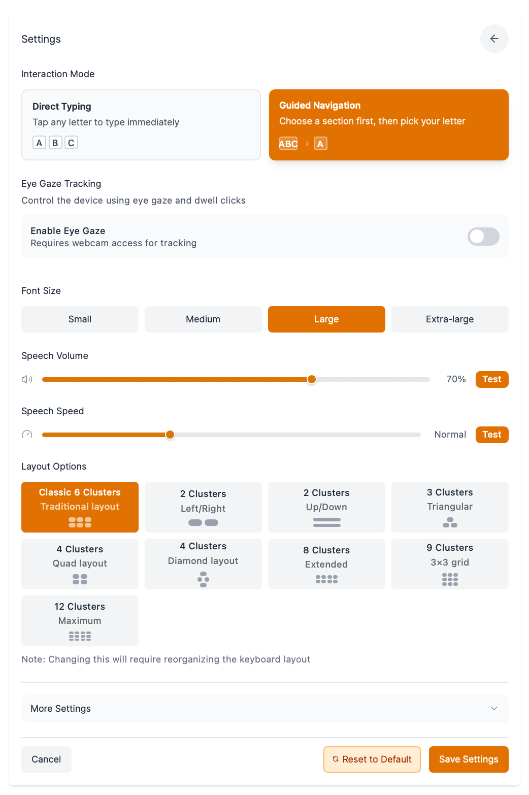
Create a keyboard that integrates predictive text.
Cluster letters and add phoneme keys (e.g. "TH") to reduce small eye movements and mis-triggered selections, lowering motor demands.
Introduce an animated "clear" state that removes unused keys after each selection to reduce clutter and allow eyes to rest.
Design for standard tablets and phones so communication partners can hold the device, preserving eye contact and social connection.
Keep visually minimalistic with limited colors, strong contrast, and clear grouping to reduce cognitive load.
Design Process
I prioritized getting a functional keyboard into Ellie's hands as fast as possible, deferring polish and settings in favor of early, frequent testing with the actual user.
Ideation & Drafting (Week 1)
Draft 1 was a communication board on Google Slides. Ellie would use eye gaze to select a category and her aide would click it leading to a new page with more options. This is a common format for communication boards.
This design is limited and not scalable as I would have to manually add each category and word option.
I switched to a keyboard design that puts more power back in the hands of the user.
Custom Designing Icons (Week 2)
After learning that Ellie struggles with spelling, we decided that small icons on each key of the board would help.
I sketched my ideas on paper and used that to create illustrations in Figma.
I tested layouts with Ellie to decide how to balance letters, icons, and white space.
UI (Weeks 3–7)
A page from the Figma design file shows a picture of the original paper and pen sketches for keyboard icons and an early iteration of the digital components.
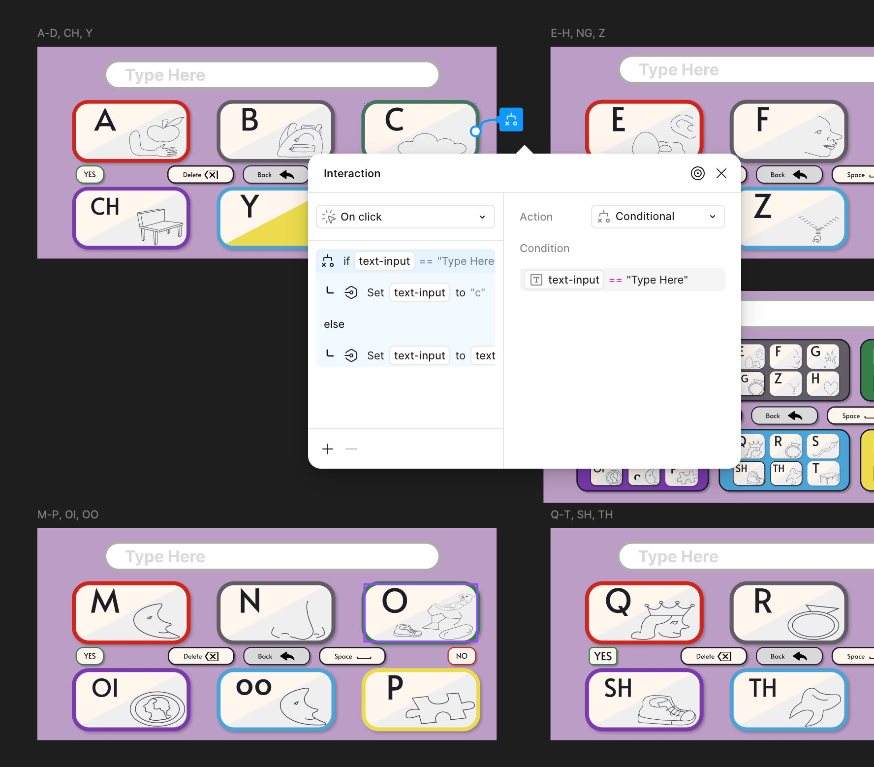
Interaction, User Testing, Prototyping (Weeks 8–12)
Make-a-Thon
In July of 2025, Figma Make became available! This drove me into a second round of prototyping to build more robust settings to personalize to a greater range of AAC users' needs.
I integrated predictive text, text-to-speech, and speech to text.
- I refined the UI to make better use of screen space.
- I switched from custom to Lucide icons for consistency.
- I improved selection feedback with scaling and highlighting.
Outcomes
Sticker Sheet
Every button, tile, and card layout, along with their interaction states, used in both the mobile and desktop designs. This sticker sheet makes modifying and personalizing the ComBoard hassle-free, allowing me to continuously provide the student with a tool that best suits her needs as she is able to communicate them to me over time. Components are organized by variant and state so that a developer can quickly inventory every UI element and map it to a code implementation.
What I Learned
One of the biggest takeaways from this project was learning when to leverage existing resources. I spent a lot of time creating custom icons, which delayed the completion of a functioning product and introduced visual inconsistencies — libraries like Lucide already had what I needed. I also gained a deeper appreciation for state management; it's not only extremely important but surprisingly complex, and poor implementation leads to messy code and a frustrating user experience. Finally, I learned that color choices go far beyond aesthetics. ComBoard went through several sets of brand colors before landing on a palette that actively supports the user experience, helping Ellie focus on selections by looking towards colors rather than trying to distinguish individual letters.
Scaling ComBoard
ComBoard was designed for Ellie, but the underlying problem — bulky, one-size-fits-all AAC tools that cause fatigue and limit social connection — affects millions of non-speaking individuals. The Make-a-Thon prototype took the first step toward scalability by introducing robust settings for layout, color themes, and input methods so the app can adapt to a wider range of motor and cognitive profiles. Looking ahead, scaling ComBoard means building a modular preset system where therapists or caregivers can configure key clusters, icon sets, and predictive vocabularies for each user without developer involvement. It also means supporting multiple input modalities — switch scanning, head tracking, and touchscreen alongside eye gaze — so the app isn't locked to a single access method. The long-term vision is an open platform where clinicians can share and refine presets across institutions, turning ComBoard from a tool built for one student into a flexible framework that any AAC user can make their own.