A11y Consulting Site
Designing a consulting site and free evaluation tools to help EdTech platforms meet accessibility standards and serve every learner.
View Live Site →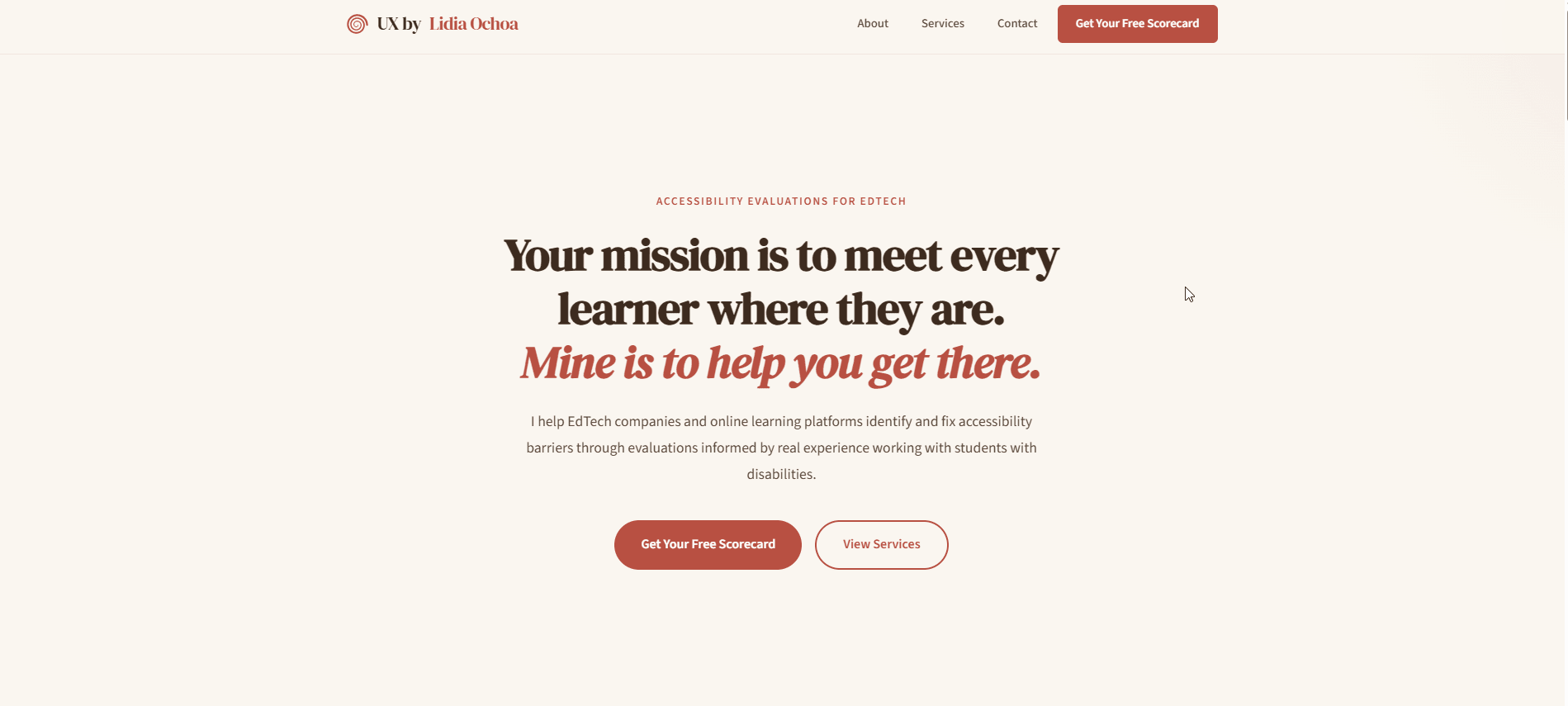
The Problem
EdTech platforms are built to educate, but many exclude the learners who need them most. One in five Americans lives with a disability, yet many educational platforms fall short of basic accessibility standards — unlabeled forms, missing heading hierarchy, no keyboard navigation, insufficient contrast. In 2024 alone, over 4,000 ADA-related web and digital accessibility lawsuits were filed in federal and state courts (UsableNet, 2024), and Title II compliance is now tied to federal education funding. The need is urgent, but many EdTech teams do not know where to start or what to fix first.
I wanted to bridge that gap: take my 7 years of classroom experience working directly with disabled students and translate it into actionable, approachable accessibility consulting that meets EdTech teams where they are.
Defining the Offering
I structured the consulting services around a simple principle: meet people at their level of readiness. Not every team is ready for a full audit, but every team can benefit from knowing where they stand.
Free Scorecard — a single-page, 10-criteria accessibility review that gives teams an honest snapshot and a reason to take the next step.
Quick Wins Guide — a free downloadable resource covering 5 high-impact accessibility fixes any EdTech team can implement immediately.
Essential Evaluation ($500) — 3–5 page review with cross-page flow analysis, annotated slide deck, and prioritized WCAG-mapped recommendations.
Comprehensive Evaluation ($2,000) — full usability audit with assistive technology testing, a 30-minute walkthrough, and a remediation roadmap.
Design Process
Visual Identity
I chose a warm, earthy palette — cream backgrounds, terracotta accents, deep brown text — to feel approachable and human rather than clinical or corporate. EdTech teams are often overwhelmed by accessibility jargon; the visual tone needed to say "I'll help you understand this" rather than "you're doing it wrong." Typography pairs DM Serif Display for headings (warmth, authority) with Source Sans 3 for body text (clarity, readability).


Content Strategy
The homepage opens with four data points — disability statistics, lawsuit numbers, user retention rates, and federal funding requirements — to establish urgency without being alarmist. The about section leads with classroom experience, not certifications, because empathy is the differentiator. Services are presented as tiers rather than a single price, so potential clients can self-select based on their readiness and budget.
Information Architecture
The site is intentionally small: a homepage with everything a potential client needs to evaluate, decide, and reach out, plus dedicated pages for the guide, scorecard, and accessibility statement. No blog, no pricing calculator, no complexity — just a clear path from "I need help" to "here's how to get it."

Interactive Features
The scorecard preview section uses an image carousel with keyboard navigation (arrow keys), dot pagination, and a lightbox for full-size viewing. The contact form integrates with Web3Forms for serverless submission. Both features were built with accessibility as a hard requirement: focus trapping in the lightbox, Escape to close, ARIA attributes on all controls.
The Scorecard
The free deliverables — the scorecard and quick wins guide — needed to do more than just introduce the consulting service. They had to be substantive enough to earn credibility on their own, demonstrating the depth and clarity of thinking a potential client would receive in a paid engagement. When someone downloads a free resource and finds it genuinely useful, trust is built before a single conversation takes place.
The accessibility scorecard is the centerpiece of the consulting offering. It evaluates a single page against 10 criteria drawn directly from WCAG 2.1, each scored out of 20 points with a severity rating and actionable recommendation. The goal was to create something useful enough that a team could act on it immediately, and specific enough that they would trust the expertise behind it.
The 10 Evaluation Criteria
Each criterion was chosen because it addresses one of the most common and impactful accessibility barriers found on digital platforms. Together, they form a focused yet comprehensive snapshot that covers structure, perception, interaction, and error recovery — the areas where users with disabilities encounter the most friction.
1. Heading Hierarchy (WCAG 1.3.1) — A logical heading structure is how screen readers build a navigable outline of the page. Without it, users who cannot see the layout have no way to scan or orient themselves.
2. Contrast Ratios (WCAG 1.4.3) — Low contrast is one of the most widespread barriers on the web. It affects users with low vision, aging eyes, and anyone in bright lighting — a fix that benefits the broadest range of people.
3. Color-Only Information (WCAG 1.4.1) — When color is the only way to convey meaning (red for errors, green for success), colorblind users miss the message entirely. Redundant cues like icons or text labels close that gap.
4. Text Sizing & Spacing (WCAG 1.4.4) — Users who need larger text or adjusted spacing to read comfortably should not have to fight the interface to get it. Text that resizes and reflows without breaking is foundational.
5. Form Labels & Inputs (WCAG 1.3.1 / 4.1.2) — Unlabeled form fields are invisible to assistive technology. If a screen reader cannot announce what a field is for, the user cannot fill it out — making entire workflows inaccessible.
6. Error Identification & Recovery (WCAG 3.3.1 / 3.3.3) — When something goes wrong, users need to know what happened and how to fix it. Vague or invisible error messages leave people stranded, especially those who cannot visually scan for red text.
7. Focus States (WCAG 2.4.7) — Keyboard users need a visible indicator showing where they are on the page. Missing or suppressed focus outlines make navigation feel like operating in the dark.
8. Keyboard Access (WCAG 2.1.1) — Every interactive element must be reachable and operable by keyboard alone. This is non-negotiable for switch users, screen reader users, and anyone who cannot use a mouse.
9. Alt Text & Images (WCAG 1.1.1) — Images without meaningful alt text are blank spots for screen reader users. Instructional images especially must describe what they teach, not just what they show.
10. Link Purpose & Interactive Labels (WCAG 2.4.4 / 4.1.2) — "Click here" and "Read more" tell a screen reader user nothing about where a link goes. Clear, descriptive labels make navigation predictable and efficient for everyone.
The Guide
The "5 Accessibility Quick Wins for EdTech Platforms" guide serves two purposes: it gives potential clients immediate value at no cost, and it demonstrates the kind of clear, actionable thinking they would get from a paid engagement. Each of the five wins was chosen because it has an outsized impact relative to its implementation effort — the kind of fix a developer can ship in an afternoon that meaningfully improves the experience for disabled users.
The guide is available both as a dedicated web page (fully accessible, naturally) and as a downloadable PDF. I designed it with the same warm visual identity as the main site so it reads as a cohesive extension of the brand rather than a generic freebie.
Accessibility
An accessibility consulting site has to meet its own standards — anything less undermines the entire premise. Every element was built and tested to WCAG 2.1 Level AA, with a published accessibility statement inviting users to report barriers.
Color & contrast: Terracotta-on-cream palette tested to meet AA thresholds (4.5:1 text, 3:1 UI). No information conveyed by color alone.
Keyboard & focus: Every interactive element — navigation, carousel, lightbox, form — is fully keyboard accessible with visible 3px terracotta focus outlines.
Semantic HTML & ARIA: Proper heading hierarchy, landmark regions, labeled forms, and ARIA attributes per WAI-ARIA 1.2 — supplementing native semantics, never overriding.
Reflow & motion: Content reflows at 320px (400% zoom) with no horizontal scrolling. All animations respect prefers-reduced-motion.
The site includes a full accessibility statement detailing conformance claims, testing methods, known limitations, and a feedback process with a two-business-day response commitment. If a consultant is going to ask clients to take accessibility seriously, they need to see that seriousness modeled.
Outcomes
The site launched with a complete consulting offering — from free tools to paid tiers — built on a foundation that practices what it preaches.
What I Learned
This project forced me to think about accessibility not just as a design skill but as a service I could package and deliver. Writing the scorecard criteria taught me to be precise about what I was actually evaluating and why — vague feedback like "improve your contrast" is useless to a developer, but "this button's 2.8:1 ratio fails WCAG SC 1.4.3; change the background from #B85042 to #8B3A30 for 4.6:1" is something they can ship in five minutes. Building the consulting site itself reinforced that accessibility is a design constraint like any other — it does not limit creativity, it focuses it. The warm, approachable visual identity I landed on is proof that WCAG compliance and distinctive design are not in tension. Finally, I learned that the hardest part of consulting is not the technical work but the communication: framing accessibility as an opportunity to serve more learners rather than a compliance burden to endure.