Budget App
A research-driven budgeting app for novice and visually impaired users — from competitive analysis and persona development through two rounds of usability testing.
View Prototype →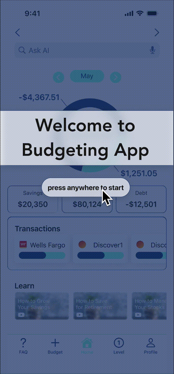
Overview
Many budgeting apps overwhelm novice users with dense dashboards, hidden core actions, and financial jargon — while failing basic accessibility standards like contrast, labeling, and keyboard navigation. For someone already stressed about money, the tool itself becomes another barrier.
Meet Edgar

Edgar is a 42-year-old HVAC manager thinking about retirement for the first time. He tried budgeting in his 20s but gave up — the tools were stressful, not helpful. As he puts it: "I've always wanted to be better with money, but it always seems too complicated, and apps that are supposed to help don't make it much easier."
Results at a glance
Journey Map: Prepare for Retirement
Edgar doesn't know where to start. Here's the path from confusion to confidence.
- Tasks
- Research online; Find resources and tools; Record target amount
- Feeling
- Confused, Overwhelmed
- Improvement
- Auto-calculate using data; Plain language explanations
- Tasks
- Log into all accounts; Calculate total assets; Track contribution methods
- Feeling
- Frustrated, Hopeless
- Improvement
- Bank integration via SSN; Auto-sum all accounts; AI contribution summary
- Tasks
- Research strategies; Calculate gap amount; Define spending categories; Allocate funds strategically
- Feeling
- Conflicted, Determined
- Improvement
- AI-powered calculation; Banking app integration; AI budget suggestions
- Tasks
- Set review schedule; Choose tracking method; Plan for setbacks
- Feeling
- Nervous, Determined
- Improvement
- AI coaching suggestions; Automated reminders/alerts
Design Decisions
I scoped the MVP around the single most stressful moment for novice budgeters — creating that first budget — and built outward from there, layering in education and personalization only after the core flow tested well.
What competitors get wrong
A competitive audit of 5 budgeting platforms revealed consistent failures: unlabeled icons and charts, sub-4.5:1 contrast, fixed 12px text, no keyboard path. Tutorials hidden in help centers. Educational content paywalled or absent. Simpler apps are outgrown as confidence increases, while complex ones overwhelm novices from day one.
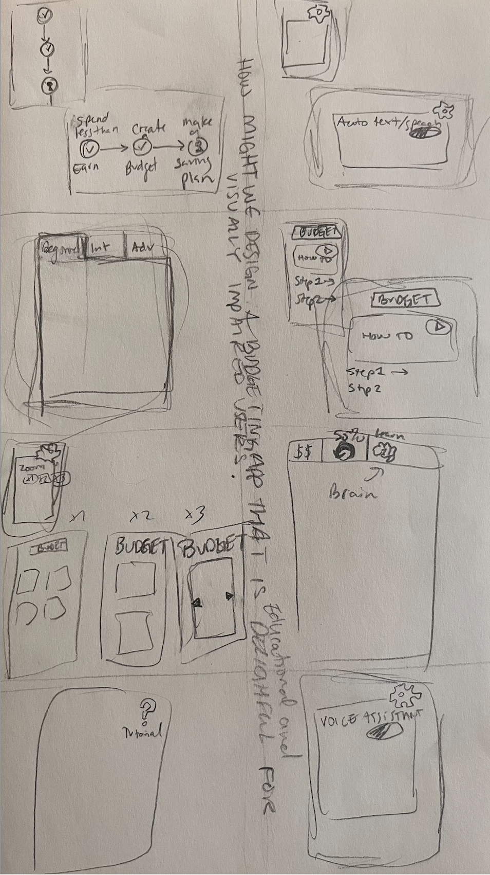
Ideation (Day 1)
Crazy 8s and a quick Close Up/Big Picture storyboard led me to two key decisions:
- Give users the ability to "level-up" their in-app experience as they learn
- Allow personalization of accessibility features early on
Testing & Iteration (Week 1–3)
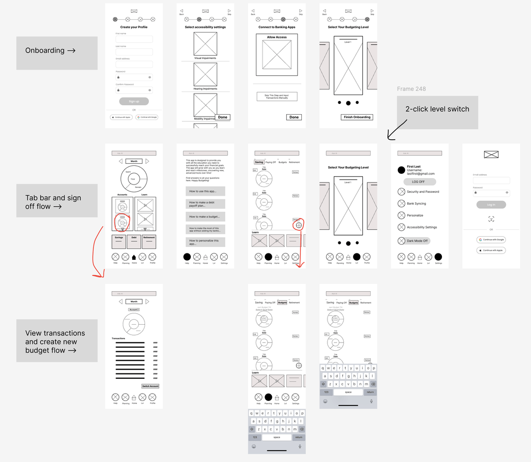
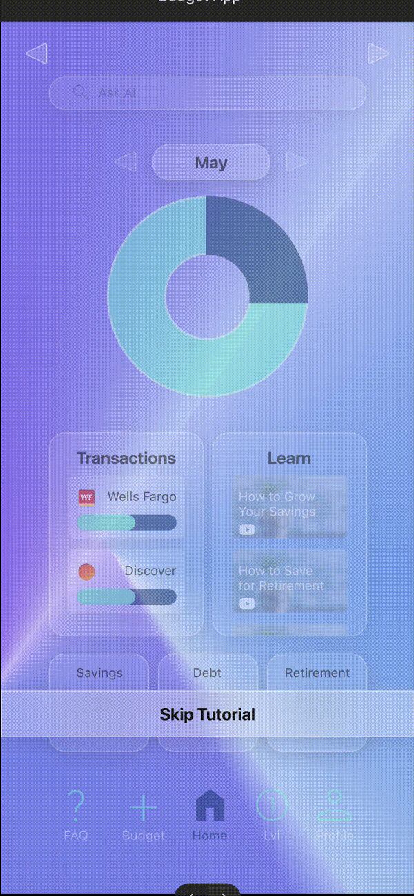
Lo-fi wireframes kept every screen within two taps via a bottom tab bar. Unmoderated usability testing with 5 participants revealed my labels weren't matching user expectations. The fix: Accounts → Transactions, Planning → Budgeting, Help → FAQ. That single round of renaming raised navigation satisfaction from 70% to 90%.
Interaction & UI (Week 4–6)
The initial glassmorphic style made WCAG-compliant contrast difficult, so I redesigned using iOS conventions and the 60:30:10 color rule.
Accessibility
Accessibility was a design constraint from day one — not a retrofit. Every decision below came directly from the competitive audit findings and user interviews.
Design for accessibility from day one — at least 4.5:1 contrast, built-in accessibility features, clear visual hierarchy.
Optional tutorial at onboarding, clear CTA button in FAQ page (easy access in main tab bar).
Introduce free "Learn" hub and level switching to manage information density and complexity.
Mobile-first, minimalist layout for visual and cognitive accessibility featuring clear hierarchy, fewer elements, and progressive disclosure.
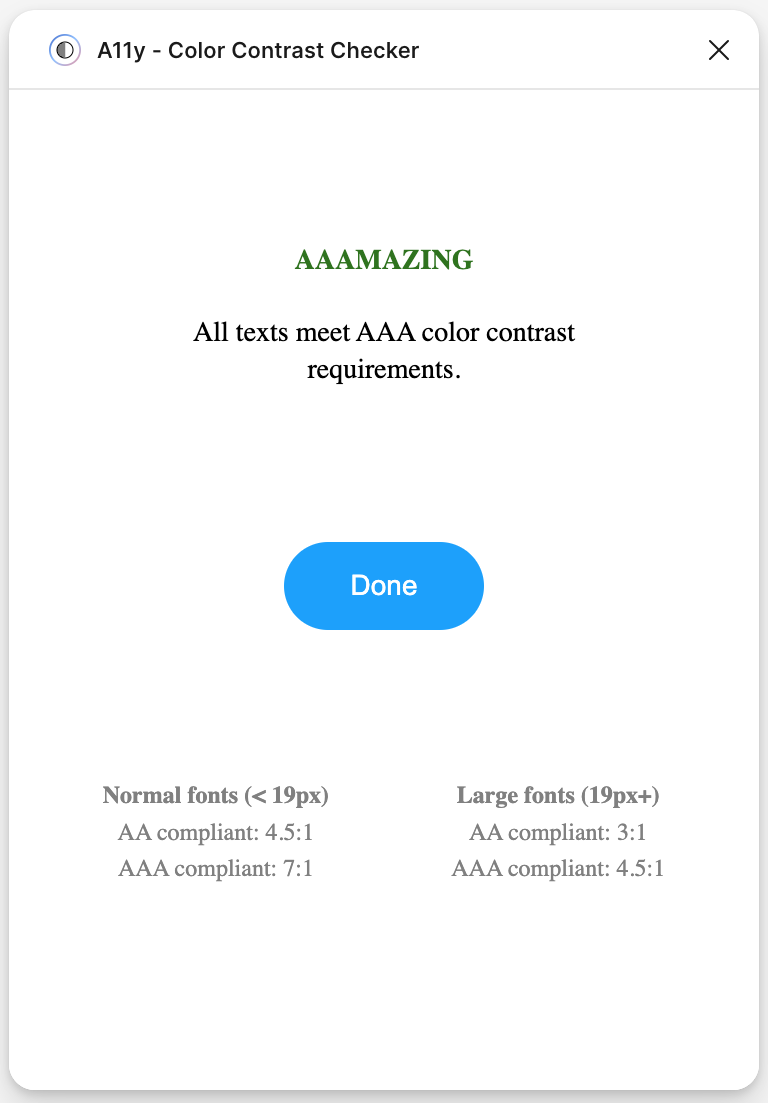
Contrast Verification
Using Stark, A11y, and Able plug-ins I verified contrast across all frames. The audit revealed the brand teal on white was too low — I changed affected labels to navy to meet AA requirements.
The Work
Before & After Redesign
Before Redesign
After Redesign
Sticker Sheet
All components grouped by category and state for fast iteration and developer handoff.
Outcomes
Five participants completed both lo-fi and hi-fi usability studies. Satisfaction rose from 75% in the first round to 90% after iterating on labels, layout, and tab navigation. All five described the app as "easy to use" and "easy to navigate."
Reflection
What I Learned
- Build reusable components early. Compiling a design system as I worked made each round of iteration faster — a habit I'll carry into team environments.
- The product is for the user, not the designer. Usability testing changed my labels, my layout, and my assumptions. Every round of feedback made the app better than my instincts alone would have.
- Accessibility from day one. Centering high-contrast palettes, readable fonts, clear hierarchy, and meaningful labels from the start is easier than retrofitting — and produces better design.