Synology LATAM Campaign
A concept bilingual mini-campaign for Synology's DiskStation DS124 — adapting the same creative across Spanish and English while keeping brand consistency, proving I don't just translate, I adapt design and message for the LATAM audience.
Overview
I created a concept bilingual mini-campaign for a Synology LATAM product to demonstrate how I'd approach localized marketing design. The campaign targets the DiskStation DS124, a prosumer/SMB NAS device, with assets designed for Instagram, Facebook, LinkedIn, and web use.
Brand Research
Before designing anything, I audited Synology's public-facing brand presence to reverse-engineer their design language and ensure my concept work would feel authentic.
What I Found
Dark aesthetic: Synology's website and marketing use deep blacks (#0B0D10) and dark backgrounds, creating a tone of security and sophistication — not the navy gradients common in generic tech marketing.
Typography: Inter is used across their web presence — clean, professional, highly legible at small sizes. Not the rounder/heavier Poppins that many tech brands default to.
Brand blue: Their signature accent blue appears consistently across CTAs and highlights. I matched this exactly from their site rather than approximating.
Product positioning: The DS124 product page targets professionals and small businesses — "Take command of your most important data." This informed my copy direction away from personal/consumer messaging.
Logo rules: White-on-dark is an approved variation. The registered trademark symbol (®) is always present. "DiskStation" is written as one capitalized word per their naming guidelines.
Tone: Corporate-professional with accessibility — clear feature documentation over aggressive marketing. CTAs are simple: "Learn more" rather than urgency-driven language.
Localization Strategy
The EN/ES pair is the strongest portfolio piece in this campaign. It proves that I don't just run copy through a translator — I adapt design, messaging, and cultural tone while keeping the visual system identical.
Side by Side
What Changed Between Languages
Design Decisions
Why I Changed the Copy from "Memories" to "Work"
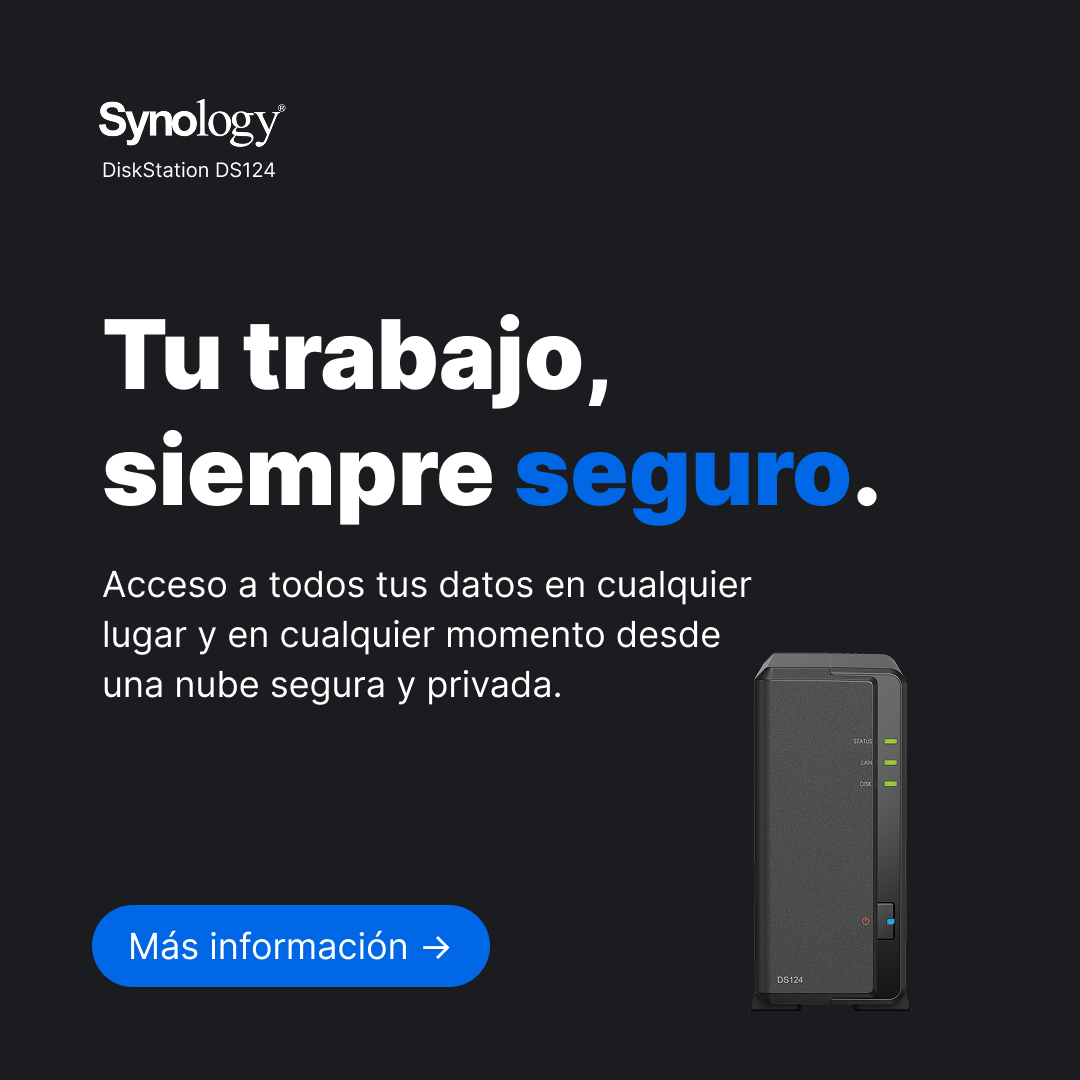
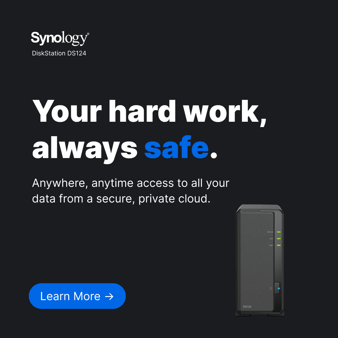
The initial brief used placeholder copy targeting personal/consumer use: "Your memories, always safe." After researching the DS124's actual product page, I found Synology positions this device squarely at professionals and small businesses. I adapted the messaging to match: "Your hard work, always safe" / "Tu trabajo, siempre seguro." This wasn't a deviation from the brief — it was an improvement based on actual product research.
Dark Background over Navy Gradient
The initial HTML mockups used a navy-to-dark-blue gradient. Synology's actual marketing uses deep blacks. I matched the real aesthetic, which also provides stronger contrast for the product photography and white headline text.
Real Product Photography
The initial mockups used a CSS-drawn NAS illustration as a placeholder. I replaced this with the actual DS124 product render, immediately making the designs read as legitimate marketing rather than generic tech mockups.
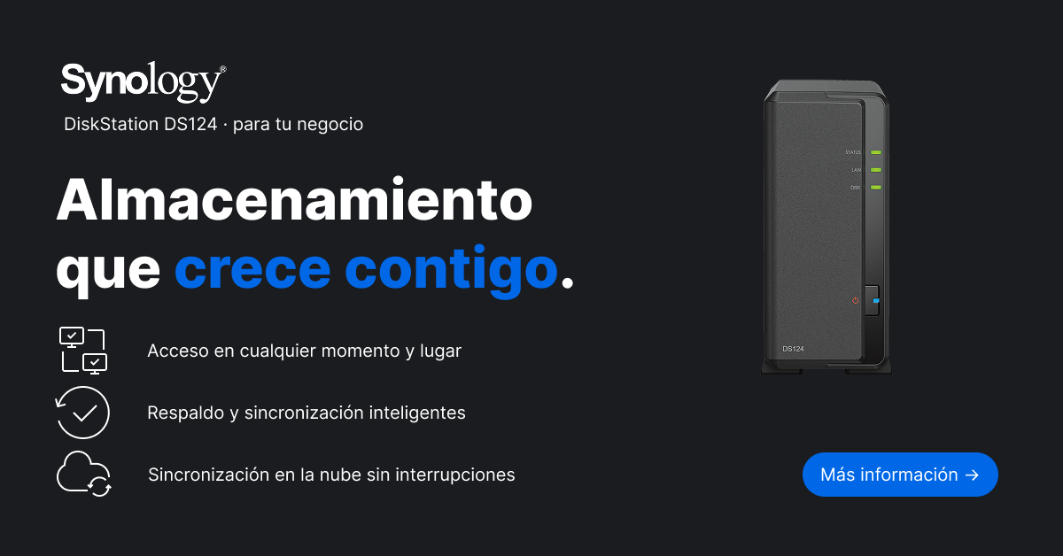
Icon-Based Feature Bullets (Web Banner)
The original web banner used pill-shaped text badges for features. I replaced these with icon + text pairs (clipboard for access, checkmark for backup, cloud for sync) which are more scannable at the small sizes a web banner is typically viewed at.
The Assets
01 — Social Square (ES) · 1080×1080
Instagram/Facebook post targeting LATAM Spanish-speaking professionals. Features the DiskStation DS124 product line label, professional-focused headline, and synology.com/es-latam URL.
02 — Social Square (EN) · 1080×1080
Same creative, localized for English. Identical layout and visual weight; copy adapted (not literally translated) for natural English. URLs point to synology.com (global) instead of the LATAM subdomain.
03 — Web Banner (ES) · 1200×628
Landscape format for web, LinkedIn, and link previews. Features the "Almacenamiento que crece contigo" headline with three icon-paired feature callouts: remote access, smart backup, and cloud sync.
What I Learned
Brand research before design saves rework. My first instinct was to use the brief's navy gradient and Poppins font, but spending time on Synology's actual website revealed a distinctly different design language — deeper blacks, Inter typeface, professional rather than consumer messaging. Starting from the brand's reality rather than assumptions produced more authentic work.
Localization is design work, not translation work. The EN and ES versions look identical at a glance, but achieving that required conscious decisions about line breaks, character count differences, and natural phrasing in each language. "Mas informacion" and "Learn More" don't have the same character count — the layout has to accommodate both without breaking.
Concept campaigns need a clear boundary. Marking this as unofficial and concept-only from the start (in the brief, in the presentation, and in the file naming) protects both my credibility and the brand's. It shows I understand how brand permissions work in a professional context.