
Co-designing a game with my student
An ongoing game project where my student helps shape mechanics, interactions, visual direction, and what 'feels right' through play.
Inspired by life
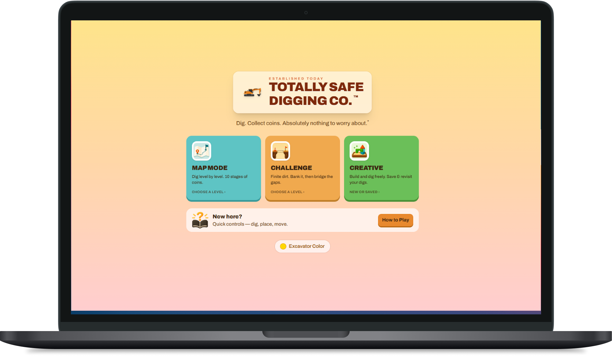
Totally Safe Digging Co. started with something concrete: my student had a real excavator in the backyard, and we had already been playing with Figma Make together.
The first version was a rough side-scrolling idea about driving an excavator, digging through the earth, collecting coins, and finding suspicious things underground. The project quickly outgrew Figma Make, so I moved it into Claude Code and turned it into a real build.
The original orange excavator sprite stayed. It had already become the face of the game, so the rest of the system grew around it rather than replacing it.
Co-designing through play
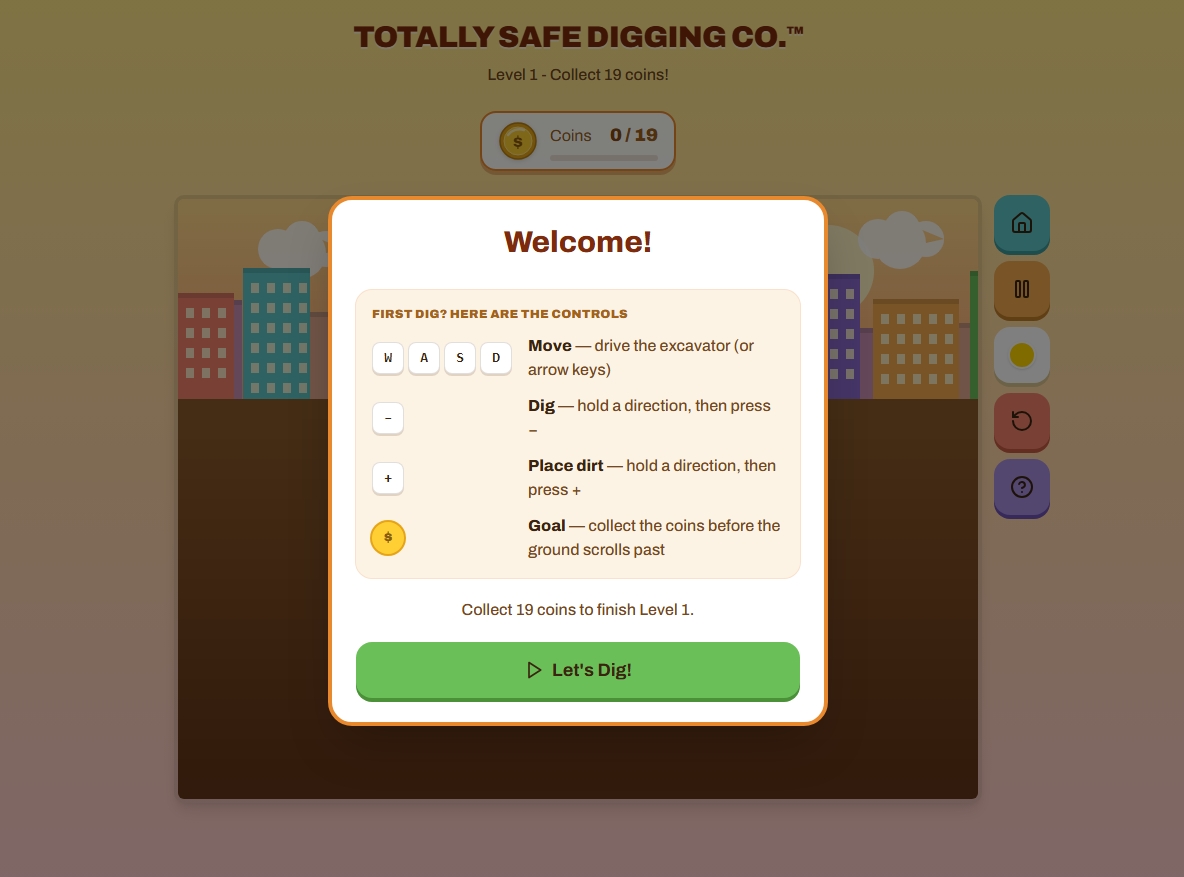
My student has been part of the product from the beginning. They pitch mechanics, react strongly to how interactions should feel, propose obstacles, and playtest changes as they are made.
I facilitate the design process, shape the product and interaction system, develop the visual language, and direct the AI-assisted implementation. The student has real product influence rather than appearing only at the testing stage.
A lot of the work happens by sitting down together and playing. We run the game, call out whatever feels wrong, stop, talk about it, fix it, and play again.
"If it did not feel right in our hands, it was not done."
Getting the interaction and animation right
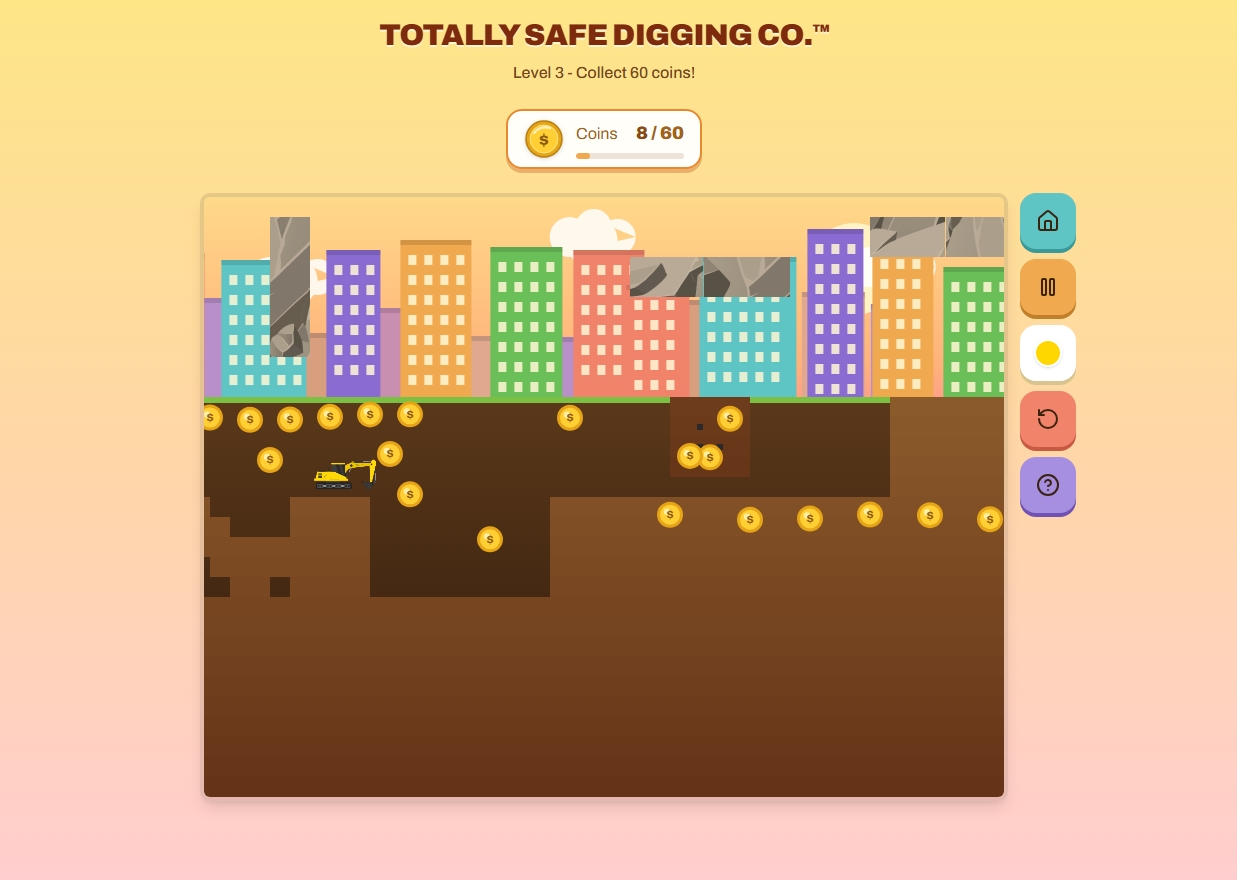
The mole encounter became the clearest example of how specific "feel" could be.
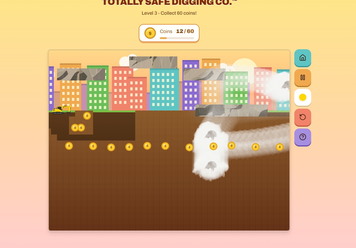
The first implementation froze the game, launched moles away from the nest, and brought them back in a chase through a large particle-fog effect. My student watched it and said:
"It was not what I wanted."
What they wanted was much softer and stranger: barely a mole, "the fog getting darker," a presence you sense before you clearly see it, and movement in "loopy loops."
The visual treatment kept changing as we got closer: darkening fog, then a silhouette, then a low-opacity full-color mole that stayed mysterious until it emerged.
The final rhythm became emerge, flee, roam in wide loops, and drift away with the auto-scroll. It is escapable. When contact happens, the mole that actually touched the excavator is the one that leaps onto it.
Building tools to clarify design decisions
The language around the mole was expressive but difficult to translate directly into numbers. We built a standalone Mole Designer so those preferences could become adjustable rather than abstract.
The tool exposed things such as movement, fog tail, hold, thickness, width, edge hardness, ghostliness, darkness, and speed with live feedback.
It did not produce the final answer in one pass. It made the conversation more precise and gave my student more direct control over the decision. We continued iterating after using it.
Once the values felt right, they were baked into the game and the tuning interface disappeared from the player-facing experience.
Fixing friction as we found it
The same play-and-fix loop shaped the rest of the game.
A level used to end while coins were still reachable. The world now stops scrolling at the end and lets the player drive to a finish fence.
A level promising a certain number of coins could actually contain more because nest coins were added on top of the target. The generator now trims to the exact total, and every screen reports the same number.
Map and Challenge originally shared progress. They became separate tracks so clearing one mode does not silently unlock the other.
Challenge mode introduced a finite-dirt economy where digging banks dirt and placing spends it, including a short stockpile window before scrolling begins.
Small pieces such as the dirt readout, stockpile prompt, onboarding, and mode structure were refined through the same process of using them together and correcting what got in the way.
Giving the game a visual system
We wrote down the visual system before finishing the polish pass.
The direction became Sunset Boom: warm dusk colors, a parallax cartoon skyline, shiny coins, chunky controls, and a consistent orange-led brand system.
The project uses design tokens for the brand orange, warm ink colors, candy action colors, and the hard-offset 3D shadow used throughout the controls.
Typography was standardized on Archivo.
A contrast pass found white text on the candy-colored controls landing around 2:1 contrast. Those surfaces moved to dark warm-ink text at roughly 7:1, and the violet was adjusted so the same rule could work consistently.
The design-system manual remains frozen as an artifact of an earlier point in the project while the live game continues to evolve.
Where the game is going
The game now has Map, Challenge, and Creative modes, clearer onboarding, a growing set of mechanics, and a running backlog of later-level obstacles and effects.
Some parts are still intentionally open: sound design, a stronger goal for Creative mode, later-level obstacles, weather effects, and additional polish around game-over timing.
AI writes the implementation under direction. The product decisions, interaction behavior, visual system, testing, and evaluation remain part of the ongoing co-design process.