
Refining a budgeting interface through two rounds of usability testing
A UX course project exploring budgeting for beginners through usability testing and iterative redesign.
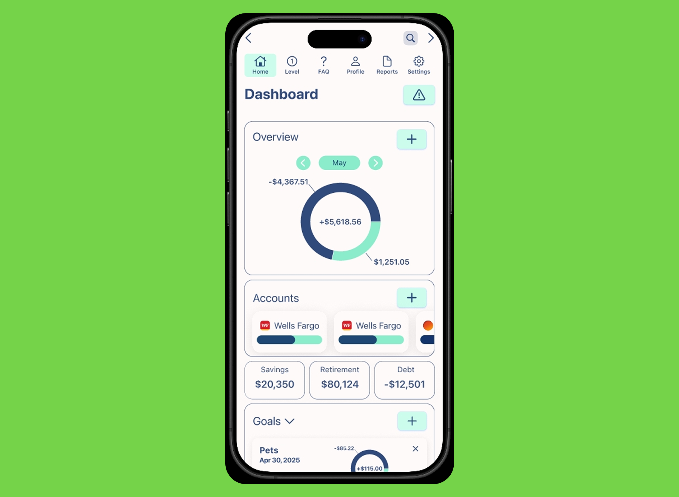
Starting with beginner needs
This was a UX course project focused on budgeting for people who were still learning how to organize and understand their finances.
The early work included research, competitive review, personas, journey mapping, accessibility requirements, sketches, and wireframes.
Testing the first direction
Five participants took part across two usability rounds.
The first round exposed problems with navigation, contrast, and visual hierarchy. The interface leaned heavily on glassmorphism, which made surfaces look polished but reduced clarity and contrast.
Simplifying the interface
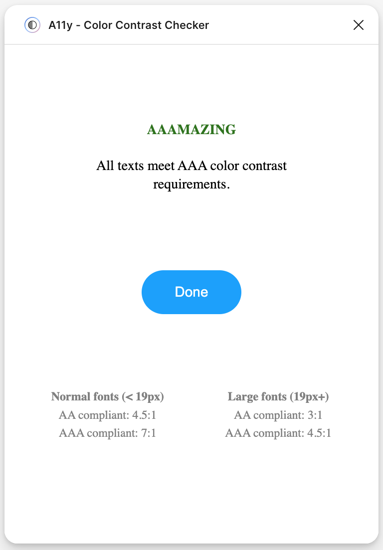
The redesign moved toward stronger contrast, clearer labels, simpler hierarchy, and more conventional interaction patterns where convention helped people understand what would happen next.
Progressive disclosure reduced the amount of information shown at once, and a Learn section gave beginners access to explanation without forcing every screen to carry instructional copy.
Testing the redesign
The second usability round tested the revised navigation and interface.
Participants moved through the prototype with fewer navigation problems, and all five later described the prototype as easy to use or navigate.
What improved
Navigation satisfaction increased from 70 to 90.
Overall satisfaction increased from 75 to 90 across the two rounds.
Scope and limitations
This was a course project and ended as a prototype.
It was designed against accessibility requirements, but the usability study did not include assistive-technology users or visually impaired participants using accessibility tools.