
Building a household budgeting product for two people with distinct tracking habits
Designed directly in working software, shaping everything from household views and transaction workflows to permissions, security, and the visual system.
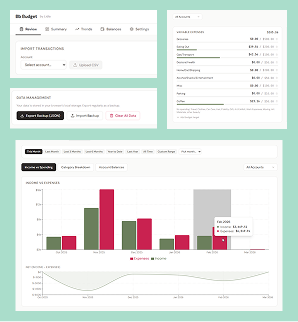
Starting in working software
Bb Budget started as a local React app for one household. I skipped a traditional wireframe phase and worked directly in functioning software, describing the problem, behavior, layout, and purpose to Claude, using what it built, noticing what felt awkward or wrong, and redirecting the next iteration.
That loop stayed consistent as the product grew: describe the intended behavior, build it, use it, find the friction, refine it, and repeat.
Claude wrote the implementation. I designed and directed the product through the working software.
I owned the product strategy, interaction design, information architecture, visual design, expected system behavior, testing and evaluation, and the product decisions that shaped each iteration.
Designing for two people
The household became the unit of the product. When one person invites another, both belong to the same household rather than maintaining separate silos that have to be reconciled later.
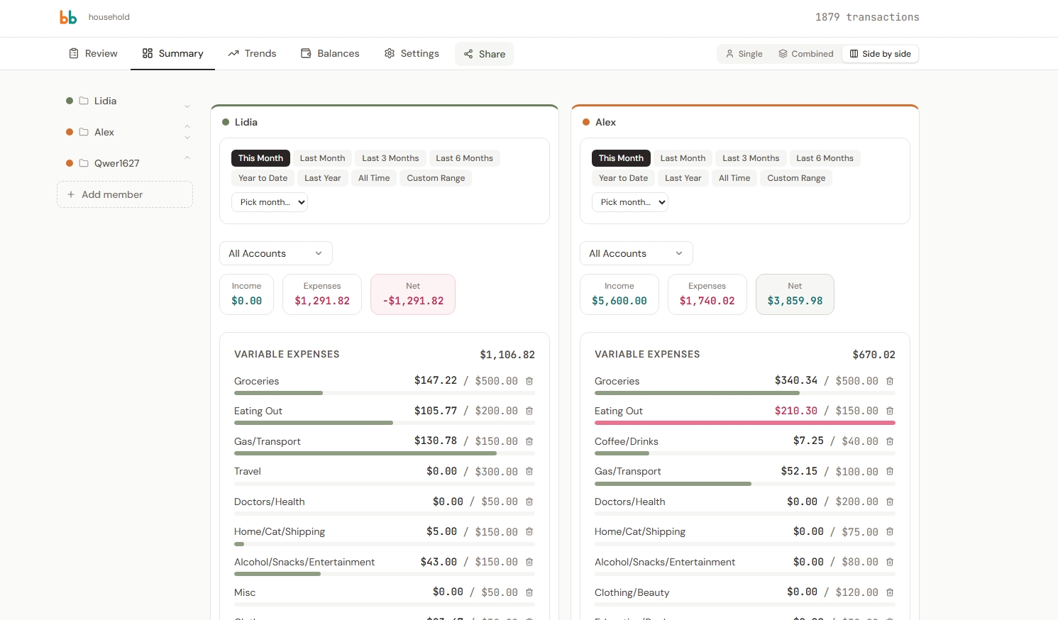
Members live on a left rail with fixed identity colors. A view-mode control switches among Single, Combined, and Side-by-side views so the same data can support different ways of looking at the household.
The two people using the product also wanted different levels of automation. One wanted bank syncing. The other preferred more manual control. The product needed to support both without forcing one person into the other's workflow.
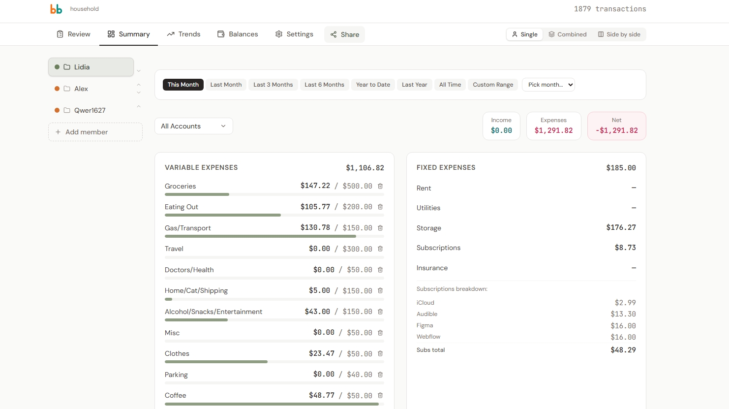
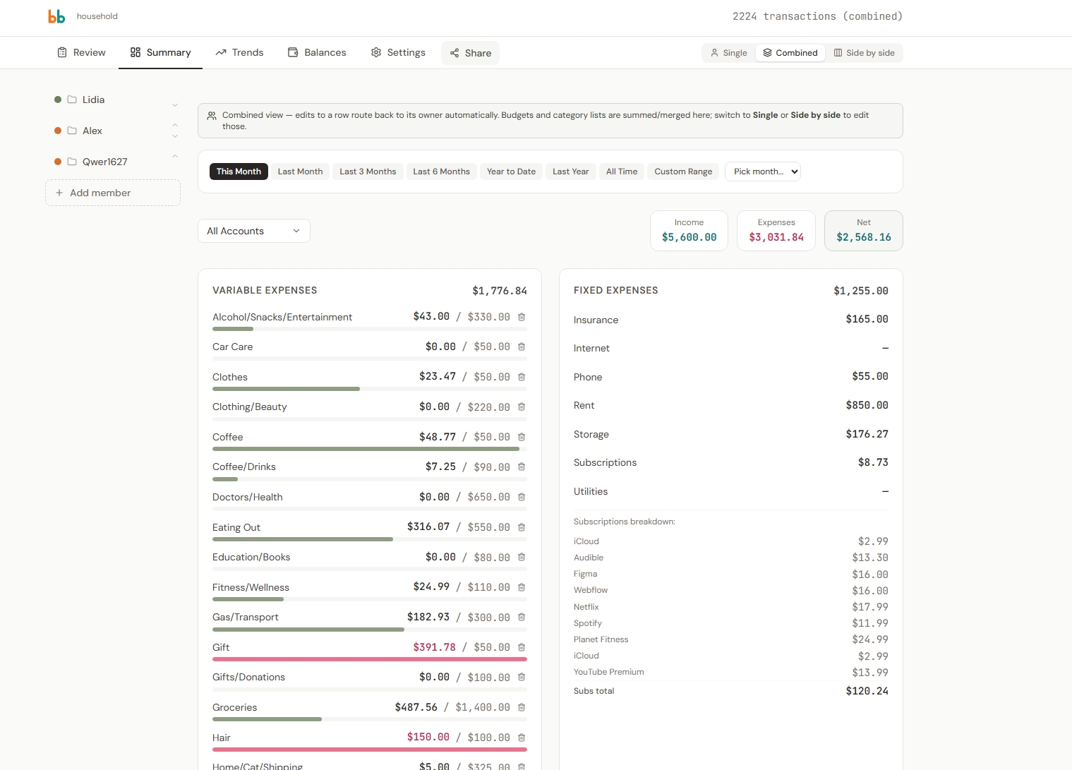
From local prototype to shared household system
The first version lived entirely in localStorage. That made experimentation cheap, but the data was trapped in one browser. It could not genuinely support sharing, survive a cleared cache, or follow a household across devices.
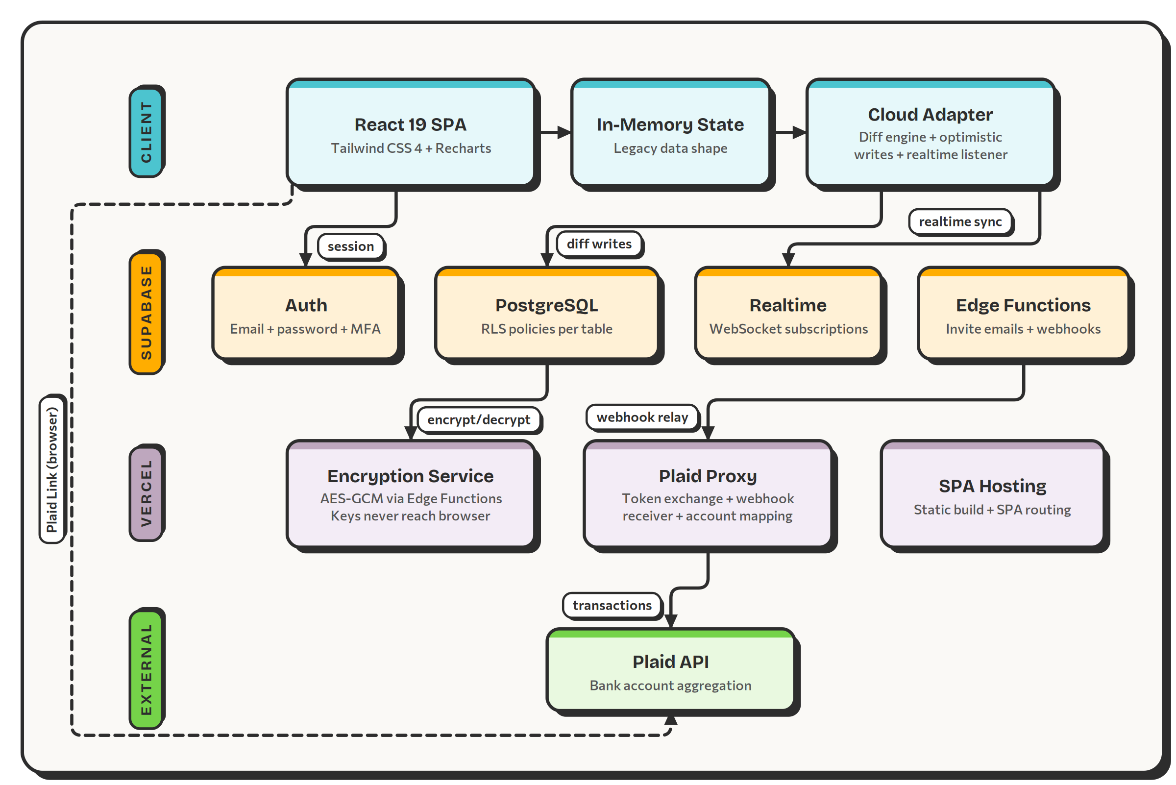
The product moved to Supabase for Postgres, Auth, Row-Level Security, and Realtime, with Vercel serverless functions handling protected operations. The existing local data was migrated into the shared backend.
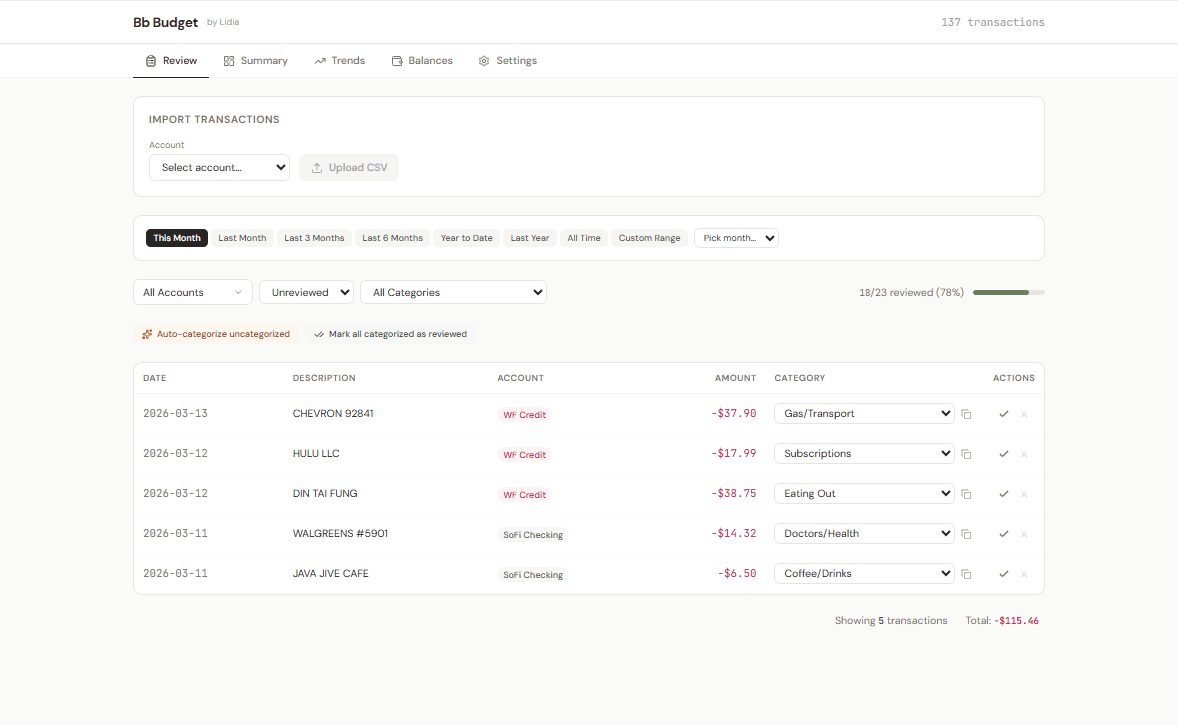
Plaid added automatic bank syncing, while manual CSV import remained available. Both workflows coexist, with deduplication so a transaction arriving through more than one path is merged rather than doubled.
The interface also had to survive the multi-user layouts it introduced. In Side-by-side mode, components that had been designed around the viewport became cramped inside half-width columns. Moving those components to container queries let each piece respond to the space it actually occupied.
Making the data reliable
The first categorizer struggled with bank-statement noise and generic category names that did not match the household's real categories.
The revised flow strips statement noise down to the merchant, checks the household's own categorization history first, and only then falls back to broader matching patterns. Canonical guesses are mapped through aliases into the categories the household actually uses.
Reliability problems also showed up in less visible places. PostgREST's default 1,000-row cap silently truncated a household with 1,531 transactions until the fetch was paginated. Plaid connections produced duplicate-looking accounts until fuzzy matching learned that names such as "EVERYDAY CHECKING" and "Wells Fargo Checking" could refer to the same account.
The product keeps both import-time deduplication and a later Find Duplicates tool because they solve different problems.
Enforcing privacy and permissions
Connecting real financial data raised the stakes for the system behind the interface.
Sensitive fields use split-trust field encryption with AES-256-GCM. The encryption key lives on Vercel while ciphertext lives in Supabase, so neither side contains everything needed on its own.
An authorized black-box security review found that the decrypt-batch endpoint could decrypt arbitrary ciphertext for any authenticated user. The fix changed the endpoint to accept row references, re-fetch the underlying records under the caller's Row-Level Security scope, and return nothing for rows the caller was not authorized to read.
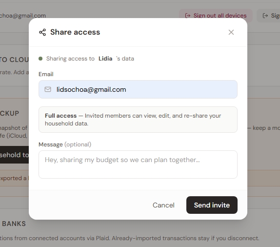
Sharing had a second enforcement problem. The product exposed can_view, can_edit, and can_reshare, but the early database policies checked household membership before those permissions. A view-only invite could therefore receive more access than the interface promised. The RLS helpers were rewritten so the backend enforces the same permissions the UI communicates.
Simplifying the product as it grew
As functionality accumulated, the product needed a more deliberate visual and structural pass.
A design-system document and typeface study established the later visual language. The chosen type system uses Bricolage Grotesque for headings, Public Sans for body text, and Red Hat Mono for figures.
The header lost a literal "household" placeholder and an orphaned transaction count. The household name became editable, the signed-in member's avatar became the account menu, and the transaction count moved to Review, where it has context.
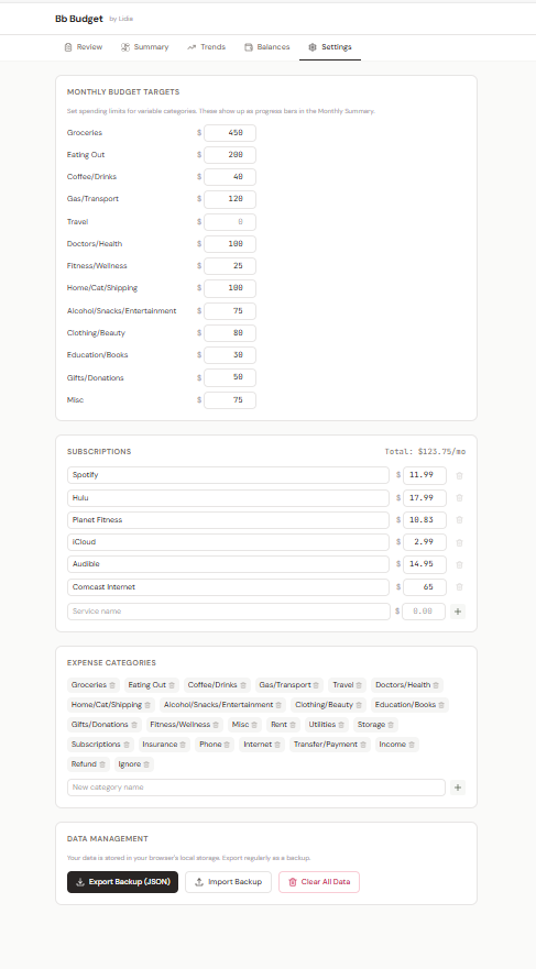
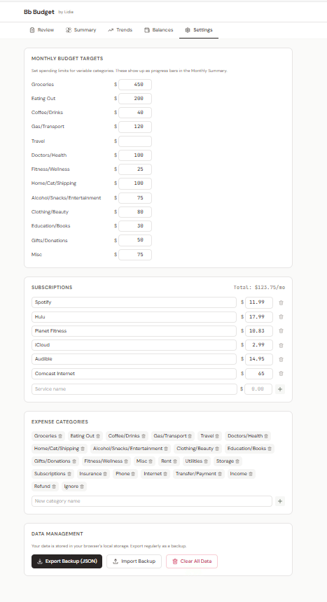
Settings had grown into more than eleven near-identical cards. They were regrouped into four sections: Account, Household & data, Money setup, and Danger zone, with navigation that makes the long page easier to scan.
A large Reconcile & Cleanup panel was also pruned. Its balance reconciler duplicated the Balances page, and its auto-categorization was weaker than the workflow already in Review. Find Duplicates remained because it solved a distinct problem. The balance-gap hint moved into the Balances flow, and the redundant section disappeared.
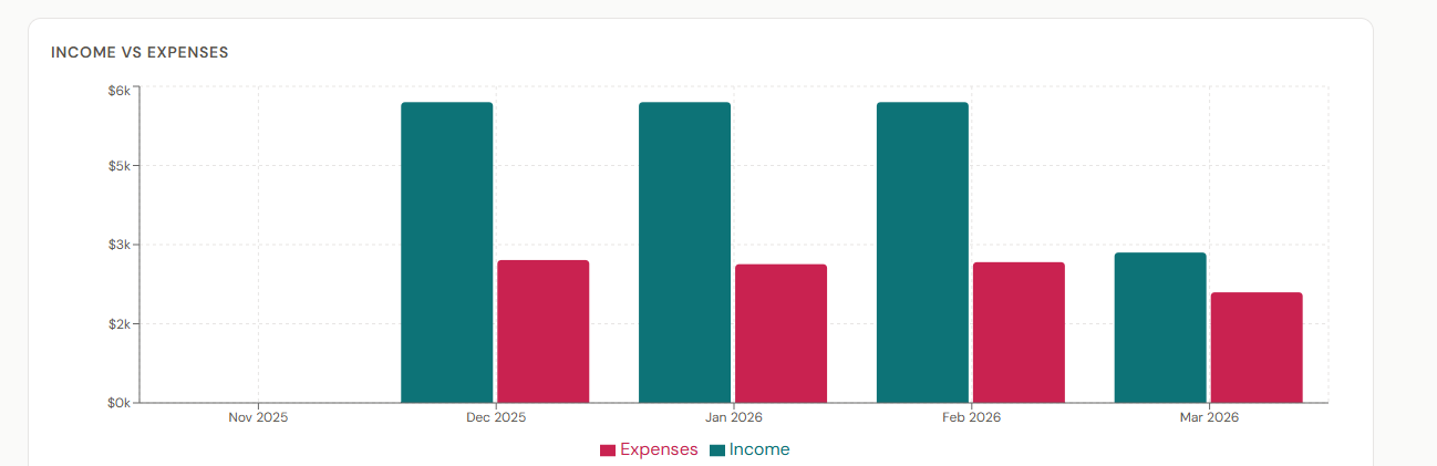
Trends gained an always-visible insights strip with spend versus last month, savings rate, top category, and biggest mover. A difficult stacked category chart was replaced with a clearer top-spending-categories view.
The logo also moved from orange and teal into the product's own sage and clay palette so the mark and interface read as one system.
What this workflow made possible
Bb Budget is used by one real household. It has grown from a local browser prototype into a multi-member product with bank sync, manual workflows, categorization, permissions, encryption, and a visual system that had to become clearer as the feature set expanded.
The product was designed by repeatedly making decisions concrete enough to use and inspect. AI was the medium used to turn those decisions into functioning software quickly enough to evaluate them.